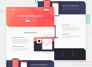
Design comparison
Solution retrospective
Hello guys, if you have any remarks just let me know in the comment section. thank you.🙏
Happy coding💻
Community feedback
- @NaveenGumastePosted almost 3 years ago
Hay ! Karim Good Job on challenge
These below mentioned tricks will help you remove any Accessibility Issues
-> Add Main tag after body
<main class="container"></main>-> Always use h1 first and then h2, h3 and so on
-> Learn more on accessibility issues
If this comment helps you then pls mark it as helpful!
Have a good day and keep coding 👍!
1 - Account deleted
Hello there! 👋
Congratulations on finishing your challenge! 🎉
I have some feedback on this solution:
-
Always Use Semantic HTML instead of
divlike<main><header>, etc for more info -
Consider using the h1 element as a top-level heading only (all h1 elements are treated as top-level headings by many screen readers and other tools) like for example use h1 first then h2 etc.
if my solution has helped you do not forget to mark this as helpful!
1 -
Please log in to post a comment
Log in with GitHubJoin our Discord community
Join thousands of Frontend Mentor community members taking the challenges, sharing resources, helping each other, and chatting about all things front-end!
Join our Discord
