Design comparison
Community feedback
- @robcrockPosted 4 months ago
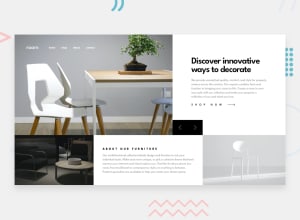
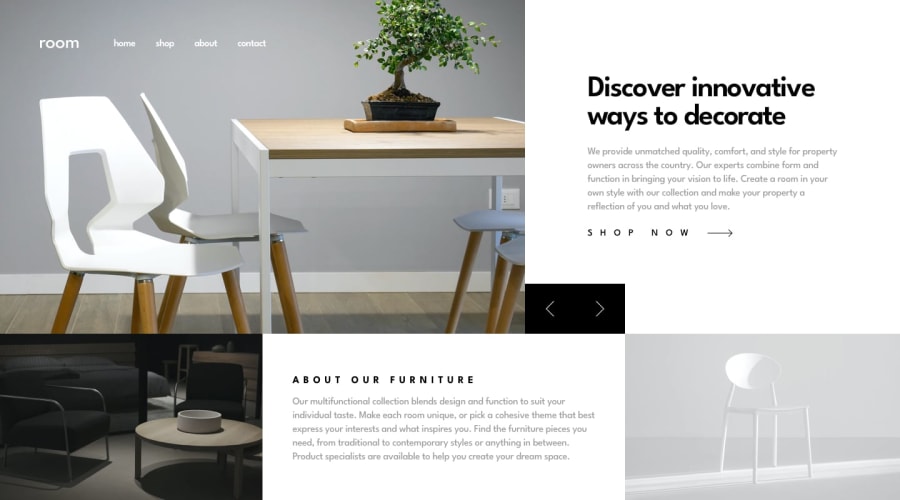
Visually, I can see that the size of the logo should be reduced and the nav moved down. The top row of content that changes is too tall and the navigation buttons are getting squished. In looking more closely at the site there a layout shift happening when you click on the nav buttons, which is a little jarring. You can also use the svg for the shop now arrow they provided instead of the character code. Speaking of code, I briefly looked at your code and noticed that you're reaching to the DOM for the toggleMenu function, which you did get working, but you might want to look at useRef when reaching out to specific DOM elements. All that being said, great work standing up this fully functioning solution 👏
Marked as helpful0
Please log in to post a comment
Log in with GitHubJoin our Discord community
Join thousands of Frontend Mentor community members taking the challenges, sharing resources, helping each other, and chatting about all things front-end!
Join our Discord
