Design comparison
SolutionDesign
Solution retrospective
What are you most proud of, and what would you do differently next time?
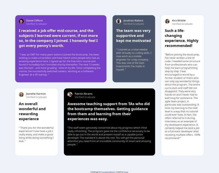
I was super proud of being able to use the css grid the first time. It worked really well for me.
What challenges did you encounter, and how did you overcome them?I came into two different challenges. One was putting the text next to the image. Two was fixing the indentations in the code so that the tags closed at the right areas. That created such a headache for me. The first issue was resolved using stack overflow.
What specific areas of your project would you like help with?I want to reduce the amount of unnecessary code.
Community feedback
- @FafellPosted about 1 year ago
- You can set the maximum width of the grid container then the content will not expand so much.
- There is also a missing SVG as the background element in the purple card.
- Also add a media query to change the grid and adapt it to different screen sizes. Apart from that your project looks great!!!! Keep practicing ;D
Marked as helpful0
Please log in to post a comment
Log in with GitHubJoin our Discord community
Join thousands of Frontend Mentor community members taking the challenges, sharing resources, helping each other, and chatting about all things front-end!
Join our Discord
