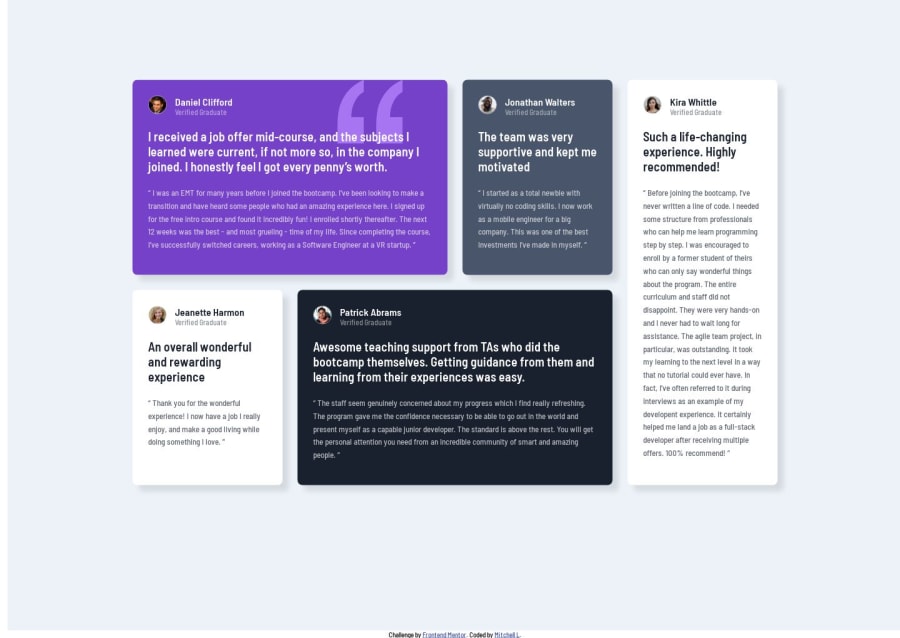
Design comparison
Solution retrospective
Do you know a youtube or article that would discuss how to accomplish switching between the vertical (mobile) and grid (desktop) views without use media queries with just CSS Grid?
Community feedback
- @ahmadabbaniPosted 12 months ago
hello, For the mobile design, modify the grid container to have a single column and five rows,and arrange the grid items in their intended order using one media querie like this: @media (max-width:768px){ .grid-container{ grid-template-rows: repeat(1fr 0.5fr 0.5fr 0.5fr 1fr); grid-template-columns: 1fr } .grid-container .grid-item:nth-child(1) { grid-column: 1; grid-row: 1; } .grid-container .grid-item:nth-child(2) { grid-column:1; grid-row: 2; } .grid-container .grid-item:nth-child(3) { grid-column:1; grid-row: 5; } .grid-container .grid-item:nth-child(4) { grid-column:1; grid-row: 3; } .grid-container .grid-item:nth-child(5) { grid-column:1; grid-row: 4; }
I hope this is helpful and addresses what you're looking for.
0@W3byMJLPosted 12 months ago@ahmadabbani
Thanks for taking the time to send that code over. For the mobile size I originally had the code set to:
.grid-container { grid-template-columns: 325px; grid-template-rows: 0.2fr 0.2fr 0.2fr 0.2fr 0.2fr; grid-template-areas: "content1" "content2" "content3" "content4" "content5"; }
And then I used the media query to break it over once it got to desktop size. But I like how your grid resizes better than what I developed.
In my original question I wanted to know if that could be done without using the media query, and I have a feeling that it can't - I would need to use Flexbox, but I'm still pretty new to this so who knows...Thanks again for sending your comment, I appreciated it!
0
Please log in to post a comment
Log in with GitHubJoin our Discord community
Join thousands of Frontend Mentor community members taking the challenges, sharing resources, helping each other, and chatting about all things front-end!
Join our Discord
