

Design comparison
SolutionDesign

Solution retrospective
Hey guys!
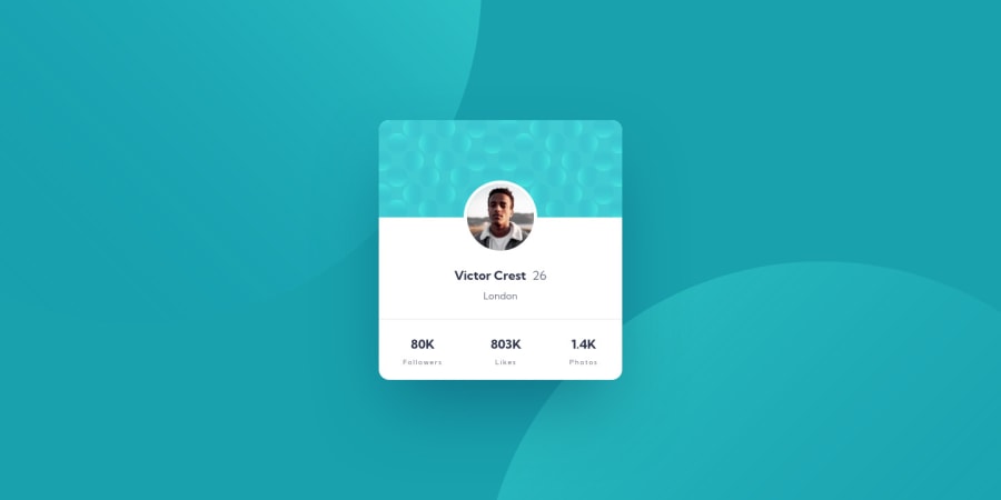
I liked the layering backgrounds challenge in this one. I was playing with a way to make the background circles adjust positioning with viewport size using calc that was smooth but didn't match up with the end design on mobile. This is my base version, it just uses media queries to match the design while I keep playing with it on a local repo. I feel like I'm overlooking what might be a simpler solution to this.
Any suggestions on how to get those background circles to be responsive while still matching the design specs? Any general suggestions/feedback also welcome!
Thanks!
Community feedback
Please log in to post a comment
Log in with GitHubJoin our Discord community
Join thousands of Frontend Mentor community members taking the challenges, sharing resources, helping each other, and chatting about all things front-end!
Join our Discord