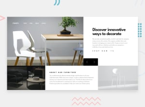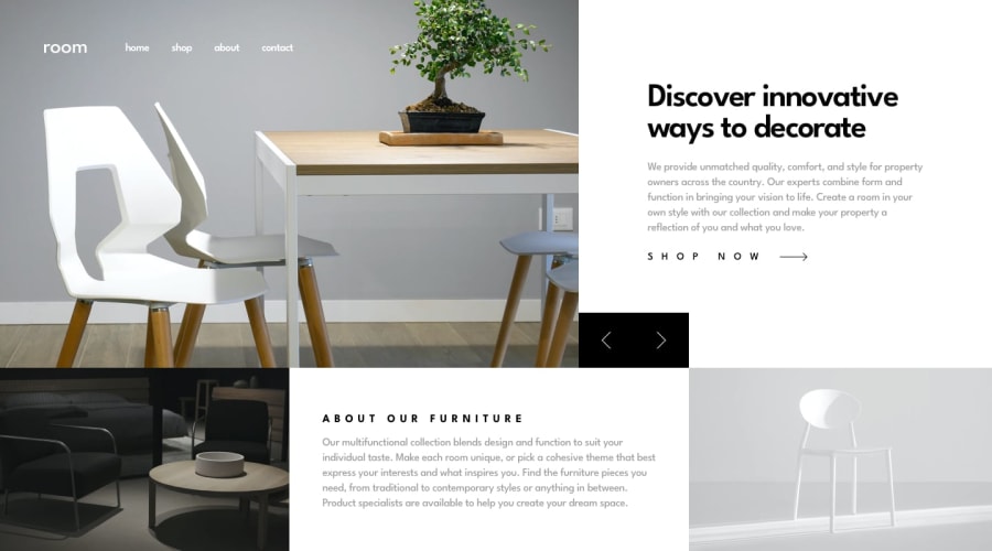
Design comparison
SolutionDesign
Community feedback
- @BeeAwwadPosted over 1 year ago
I like your burger menu animation ( I think I'll steal it ) you can add this style ".brightness-50 {filter: brightness(50%);}" when your burger menu is open to make your pictures and other stuff grayish, It worked for me. I think you should have added a media query for screen size of 640px+ and displayed the content as grid just the way you did it in the desktop view.
Marked as helpful0
Please log in to post a comment
Log in with GitHubJoin our Discord community
Join thousands of Frontend Mentor community members taking the challenges, sharing resources, helping each other, and chatting about all things front-end!
Join our Discord
