Submitted about 1 year ago
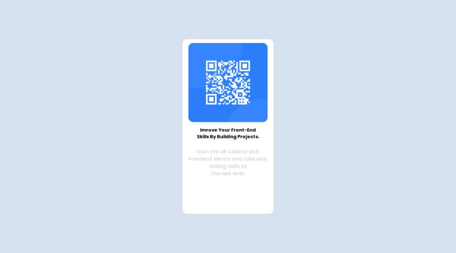
CSS Grid and Flexbox to place the code at the center of the screen
@Zwelihlecomet2
Design comparison
SolutionDesign
Solution retrospective
What are you most proud of, and what would you do differently next time?
I am most proud that I am now a little bit better in media queries, however I still need to focus more on them, especially when it comes to orientations.
What challenges did you encounter, and how did you overcome them?making sure that QR Code image fits perfectly inside the div the way I wanted it to be.
What specific areas of your project would you like help with?I would Like to get help in media queries.
Please log in to post a comment
Log in with GitHubCommunity feedback
- @jreitman007
Pretty good. Try making the box smaller to remove some of the whitespace from the bottom. Make the grey text a bit of a darker color as well so that it's easier to read.
Join our Discord community
Join thousands of Frontend Mentor community members taking the challenges, sharing resources, helping each other, and chatting about all things front-end!
Join our Discord
