Not Found
Not Found
Not Found
Not Found
Not Found
Not Found
Not Found
Not Found
Not Found
Not Found
Not Found
Not Found
Not Found
Not Found
Not Found
Not Found
Not Found
Not Found
Not Found
Not Found

Submitted

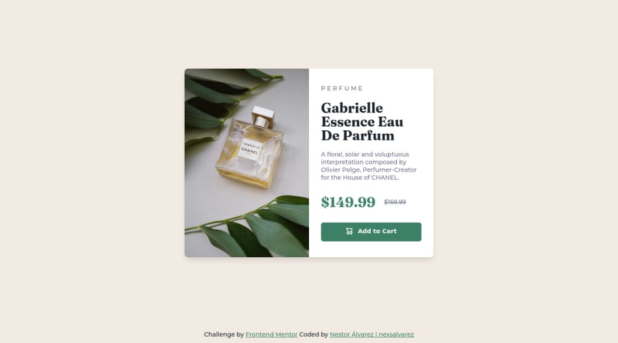
CSS Grid and Flexbox solution for the challenge "Product Preview Card"

@nexsalvarez

Desktop design screenshot for the Product preview card component coding challenge

This is a solution for...

  • HTML
  • CSS
1newbie
View challenge

Design comparison


SolutionDesign

Solution retrospective


Do you prefer to use a separate CSS document for responsive styles or do you use media queries directly?

Community feedback

Lucas 👾 104,420

@correlucas

Posted

👾Hello @nexsalvarez, Congratulations on completing this challenge!

Your solution its almost done and I’ve some tips to help you to improve it:

Using <picture> you’ve more control over the elements and its better than using the product image as <img> or background-image. Look that for SEO and search engine reasons it isn't a better practice to import this product image with CSS since this will make it harder to the image. You can manage both images inside the <picture> tag and use the html to code to set when the images should change setting the device max-width depending of the device (phone / computer) Here’s a guide about how to use picture: https://www.w3schools.com/tags/tag_picture.asp

Use units as rem or em instead of px to improve your performance by resizing fonts between different screens and devices.

To save your time you can code your whole page using px and then in the end use a VsCode plugin called px to rem here's the link → https://marketplace.visualstudio.com/items?itemName=sainoba.px-to-rem to do the automatic conversion or use this website https://pixelsconverter.com/px-to-rem

✌️ I hope this helps you and happy coding!

Marked as helpful

1

@VCarames

Posted

Hey @nexsalvarez, great job on this project!

Regarding your question, it's up to you. When making light/dark themes a usually use separate files to keep my CSS code clean.

Some suggestions to improve you code:

  • When using images that are different size for different breakpoints, its’ far more effective to use the <picture> element. By using this element not are able to use different size images, you can also save on bandwidth, meaning your content loads faster.

Syntax:

  <picture>
    <source media="(min-width: )" srcset="">
    <img src="" alt="">
  </picture>

Source:

https://www.w3schools.com/html/html_images_picture.asp

https://web.dev/learn/design/picture-element/

Happy Coding!

Marked as helpful

0

@nexsalvarez

Posted

@vcarames wow! Thank you very much for this contribution

0

Please log in to post a comment

Log in with GitHub
Discord logo

Join our Discord community

Join thousands of Frontend Mentor community members taking the challenges, sharing resources, helping each other, and chatting about all things front-end!

Join our Discord