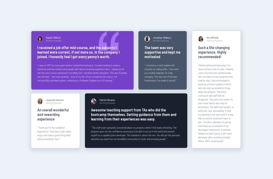
Design comparison
SolutionDesign
Solution retrospective
What are you most proud of, and what would you do differently next time?
I am very happy with getting to grips with flexbox and CSS grid. Also using the position reletive and absolute positiong and custom CSS properties
What challenges did you encounter, and how did you overcome them?positiong aspect but done some research on google to find a solution
What specific areas of your project would you like help with?N?A
Community feedback
- P@developer-rubenPosted 10 months ago
Hi!
Nice component, here are my tips:
- Avoid classes like person__details__container, this is not correct according to the BEM methodology, just make it a separate block
- You could replace the div element with class person__details__container with the header tag to make more use of semantic elements
- Add height and widths to your images so the page doesn't move around when loading the images
Best, Ruben
0
Please log in to post a comment
Log in with GitHubJoin our Discord community
Join thousands of Frontend Mentor community members taking the challenges, sharing resources, helping each other, and chatting about all things front-end!
Join our Discord
