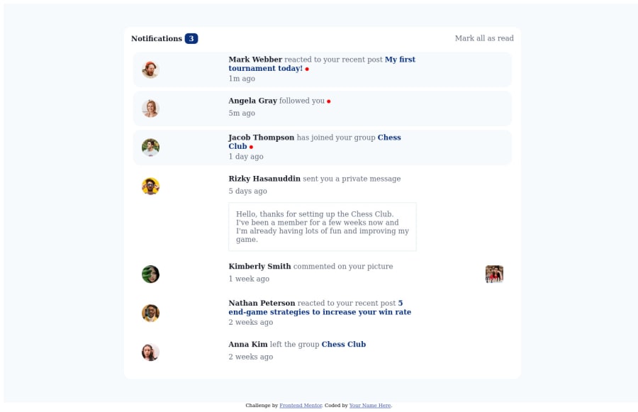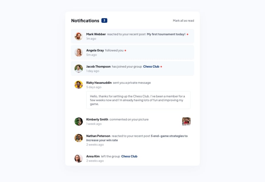
Design comparison
Solution retrospective
It took me a long time to figure the grid layout, as this is my first time working with CSS Grid. Is there a better way to set the layout up?
Community feedback
- @RubenSmnPosted about 2 years ago
Hi Jakub, nice work on this Notification page challenge. I looked at your code and found some things you could improve upon.
-
A good practice is the separation of concerns, currently you have all your code in the same file. You can move the JavaScript and CSS to their own file which makes your code more readable. Once your project becomes bigger it is easier to search for something.
-
A nice feature you can add here and practice JavaScript even more is to try and add functionality to click on individual unread notifications to make them read.
Hope you find this useful, happy hacking!
Marked as helpful1 -
Please log in to post a comment
Log in with GitHubJoin our Discord community
Join thousands of Frontend Mentor community members taking the challenges, sharing resources, helping each other, and chatting about all things front-end!
Join our Discord
