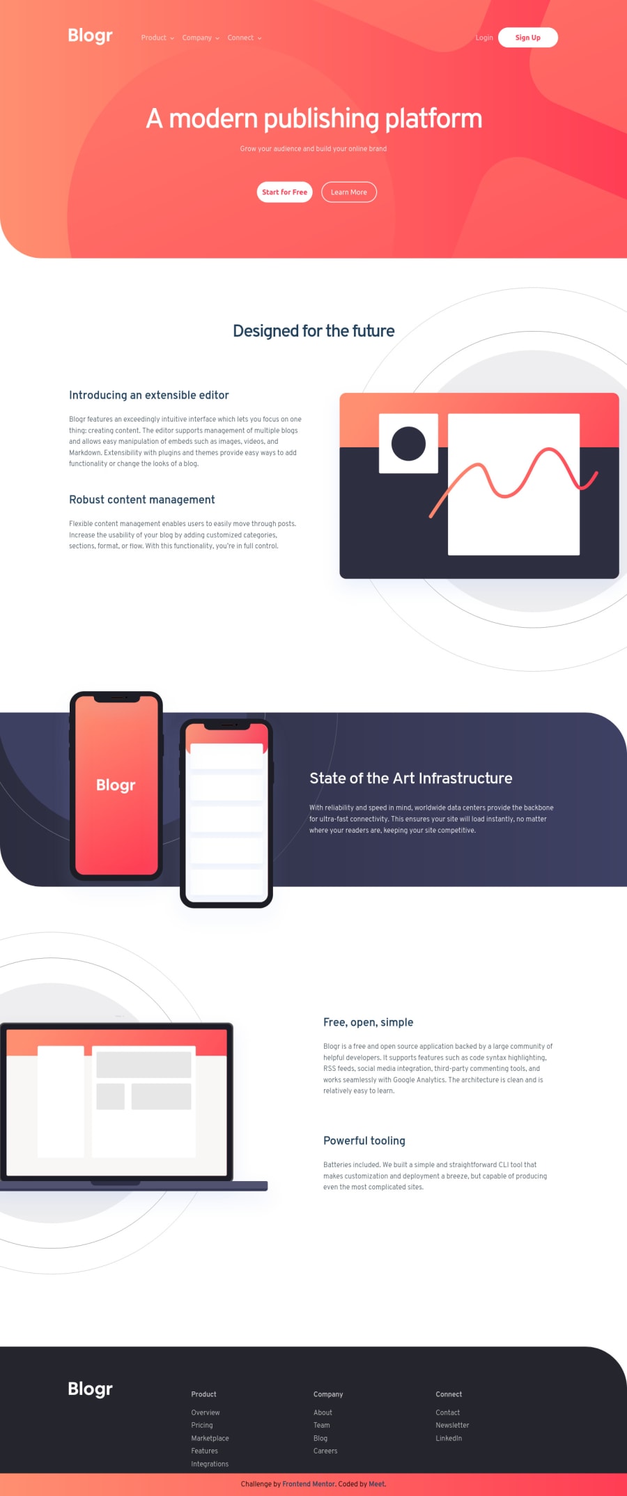
Design comparison
Solution retrospective
It seemed to be very easy at first sight but, the navigation bar literally came out to be the villain 😅😂. It was a very nice experience, I would love to take more challenges. How was your experience with this challenge guys? and Which part seemed to be easy but, was tough for you?😅😂😂
Community feedback
- @palgrammingPosted over 3 years ago
Looks like you did a good job with this. It might be nice to make it that only one of the sub-menus can be open at a time. But great Job with your results of this challenge
Marked as helpful3@b-meetPosted over 3 years ago@palgramming Thanks for the suggestion I will take care of it next time buddy. Thanks again for your appreciation, it encouraged me 😉.
1 - Account deleted
Hello B-meet,👋
Congratulations on completing your first challenge 🎉👏
Your solution looks good 😊
I have also completed this challenge, you can checkout my solution.
Great work here
All the best for your upcoming challenges 👍
Have fun coding ⌨️
0@b-meetPosted over 3 years ago@Nik-web12 thanks Nikhil and best of luck to you too
0 - @YannisHaismannPosted over 3 years ago
Hey, first great job, that's very close of the illustration. I see two things you need to work on. 1- I'm on a 3440x1920 device (21/9) and the website is not responsive for my screen.(try it yourself to see the problem) 2- More an advice than a problem, that can be easier to navigate on nav if we can click somewhere else and the menu reply itself.
Sorry for my english, keep working on your code that's very cool to see that was a nice experience for you :)
0@b-meetPosted over 3 years ago@YannisHaismann thank you so much, buddy. I will try to fix the problems. but the second thing is a little bit tricky to understand I did not get it. 😅😅
0
Please log in to post a comment
Log in with GitHubJoin our Discord community
Join thousands of Frontend Mentor community members taking the challenges, sharing resources, helping each other, and chatting about all things front-end!
Join our Discord
