Design comparison
Solution retrospective
Any feedback would be appreciated
Community feedback
- @grace-snowPosted almost 4 years ago
Hi Jules,
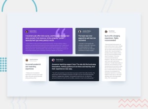
Take another look at the mobile layout on small phones. The cards are really narrow for me, way more than in the original design. Should be very easy to fix.
I'd also add the shadow to the white cards so they match the design.
In the html I think you're misusing the small element at the moment, where paragraphs should be used. See the html 5 living standard for info: https://html.spec.whatwg.org/multipage/text-level-semantics.html#the-small-element
I hope this is helpful to you. Good luck with your coding and learning ☺
2@julespereira96Posted almost 4 years ago@grace-snow and i totally forgot about the shadows.
0@grace-snowPosted almost 4 years ago@julespereira96 remember to upvote if comments are helpful ☺
2 - @horsirhonPosted almost 4 years ago
check for pull requests
1@horsirhonPosted over 3 years ago@julespereira96 Go to Github, log In and on the navbar you'll see a button that says pull requests.. You'll be able to see the changes other people made to your code and can merge those changes with the original..
i sent a pull request after making some changes..
sorry for the late reply.. :-)
PS: most of the changes are to paddings and margins..
0
Please log in to post a comment
Log in with GitHubJoin our Discord community
Join thousands of Frontend Mentor community members taking the challenges, sharing resources, helping each other, and chatting about all things front-end!
Join our Discord
