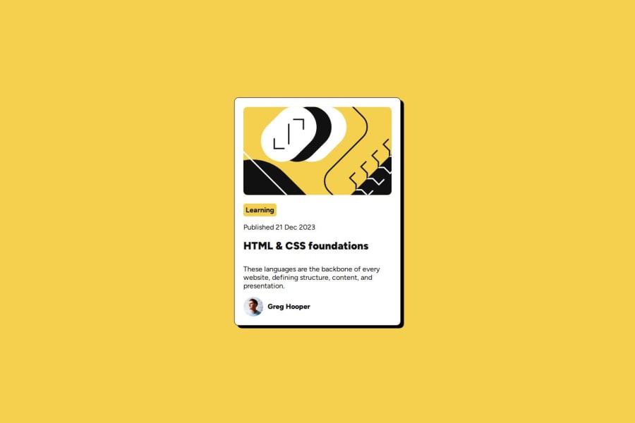
Design comparison
SolutionDesign
Solution retrospective
What are you most proud of, and what would you do differently next time?
that was easy
What challenges did you encounter, and how did you overcome them?that was easy
What specific areas of your project would you like help with?that was easy
Community feedback
- @jacobtrinhPosted 8 days ago
Looks good, the sizing is great and perfect. I think you got it on the dot. However, the border radius can use some fine tuning. Also, the size of the profile picture and profile is too big and can use a bit of adjustment. Font sizes, line heights, and font weights need some adjusting as well. "learning" button needs padding adjustments.
0
Please log in to post a comment
Log in with GitHubJoin our Discord community
Join thousands of Frontend Mentor community members taking the challenges, sharing resources, helping each other, and chatting about all things front-end!
Join our Discord
