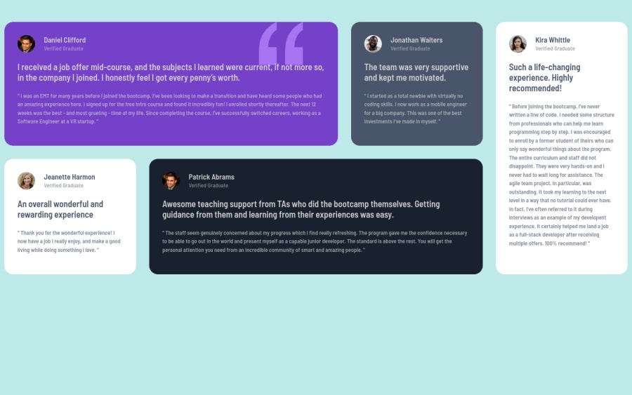
Design comparison
SolutionDesign
Solution retrospective
please take out time to give feedback on this challenge. Thanks
Community feedback
- @muhammadshajjarPosted about 3 years ago
Hi saykeed, Nice work, I think some minor changes make your solution looks more similar to design
- Some changes on the body, you should use this color
background-color: hsl(210deg 46% 95%);as background-color - make your content perfectly center this would help
use body or make container class{ min-height: 100vh; display: flex; justify-content: center; align-items: center;- instead of giving widths to
grid-template-columnsuse1frwhich is handier to achieve design - use
max-width:1110pxon card container because card container is not 1440px, this disturbs your hole design - Give a look to report to overcome accessibility and HTML issues
Hope it would help you
Marked as helpful1@saykeedPosted about 3 years agoHi muhammadshajjar, thanks so much, I really appreciate u taking ur time to go over my solution. I will adjust the design, may Allah bless you.
0 - Some changes on the body, you should use this color
Please log in to post a comment
Log in with GitHubJoin our Discord community
Join thousands of Frontend Mentor community members taking the challenges, sharing resources, helping each other, and chatting about all things front-end!
Join our Discord
