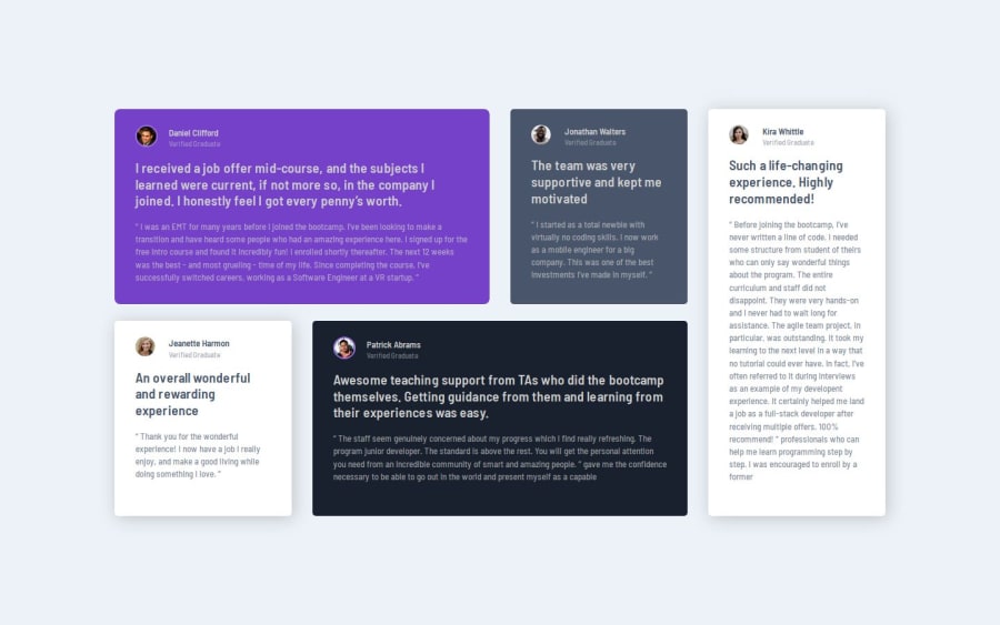
Design comparison
Solution retrospective
This project was done without a layout for figma, so there were problems with sizing and indentation.
What specific areas of your project would you like help with?I will be glad to receive any useful comments
Community feedback
- @Grimm-NPosted 12 days ago
First of all, fantastic work! 🎉 It’s clear you’re really putting in the effort, and the results look awesome. Great attention to styling and structure—it’s coming together beautifully! 👏
A few suggestions that might be helpful as you continue refining:
-
Consider a Two-Column Layout on Medium Screens: Right now, the cards look great on desktop and mobile, but a two-column layout on medium screens could make things feel more balanced and readable at that in-between size. 📱→💻 It will also help prevent the “stretched” look as screen sizes increase, making for a smoother user experience.
-
Tiny Typo Alert in the Closing Tag: I noticed a small typo in your closing tag:
</div class="reporter__information">
. The closing tag should be</div>
without any class attributes. This is because the closing tag only needs to close thediv
element itself; adding a class there can confuse the browser and cause unexpected styling issues. 🔍 -
Use Relative Units Instead of Pixels: Switching to units like
em
,rem
,%
,vh
, andvw
instead of pixels can help make your design more flexible and responsive. 💪 Relative units adjust more gracefully to different screen sizes and user settings, making your design accessible and more adaptable in the long run. -
Try Adding an Image of Quotation Marks in the First Card: Placing an image of double quotation marks (like in the example) could be a great way to practice positioning and styling. 🖼️ This will not only give you hands-on experience with image placement but will also add a bit of visual flair to the card, making it feel more dynamic and engaging!
Keep up the amazing work—these tweaks will just add the final polish to your already great design! 🎨✨
Marked as helpful1 -
- @Fender60Posted 12 days ago
Thank you very much for the detailed and thorough review, it is very helpful to me. Especially about the adaptive for medium screens, next time I will be more attentive to such details thanks to you.
0
Please log in to post a comment
Log in with GitHubJoin our Discord community
Join thousands of Frontend Mentor community members taking the challenges, sharing resources, helping each other, and chatting about all things front-end!
Join our Discord