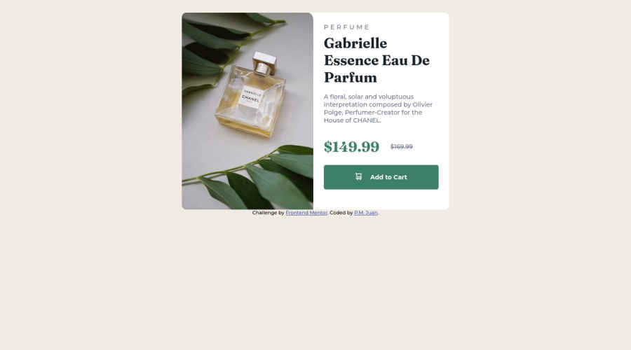


Design comparison

Community feedback
- @correlucasPosted about 2 years ago
👾Hello @Kishp73, Congratulations on completing this challenge!
I've just opened your live site and I can say that you did a great job putting everything together! There's some tips to improve your solution:
1.Your component is okay but it's missing the vertical alignment. The best way to do it is by using
flexbox. First step is to addmin-height: 100vhto make the body height size becomes 100% of the screen height, this way you make sure that whatever the situation the child element (the container) align the body and then use the flex properties for alignment withdisplay: flex/align-items: center;/justify-content: center;body { min-height: 100vh; /* min-height: 100%; */ text-rendering: optimizeSpeed; /* font-family: 'Fraunces', serif; */ font-family: 'Montserrat', sans-serif; margin: auto; padding: 1.8rem 0.8rem 0; background-color: var(--Cream); display: flex; flex-direction: column; align-items: center; display: flex; justify-content: center; }2.Don’t use
idto give the style of your elements, it's not a good idea becauseidis a too specific selector used forformsand Javascript code. Instead, useclassfor styling and let theidfor much specific stuff. It's also not advisable to use IDs as CSS selectors because if another element in the page uses the same/similar style, you would have to write the same CSS again. Even if you don't have more than one element with that style right now, it might come later.3.THE PICTURE TAG is a shortcut to deal with the multiple images in this challenge. So you can use the
<picture>tag instead of importing this as an<img>or using a div withbackground-image. Use it to place the images and make the change between mobile and desktop, instead of using adivorimgand set the change in the css withdisplay: nonewith the tag picture is more practical and easy. Note that for SEO / search engine reasons isn’t a better practice import this product image with CSS since this will make it harder to the image. Manage both images inside the<picture>tag and use the html to code to set when the images should change setting the devicemax-widthdepending of the device desktop + mobile.Check the link for the official documentation for
<picture>in W3 SCHOOLS:https://www.w3schools.com/tags/tag_picture.asp✌️ I hope this helps you and happy coding!
1

Please log in to post a comment
Log in with GitHub
Join our Discord community
Join thousands of Frontend Mentor community members taking the challenges, sharing resources, helping each other, and chatting about all things front-end!
Join our Discord