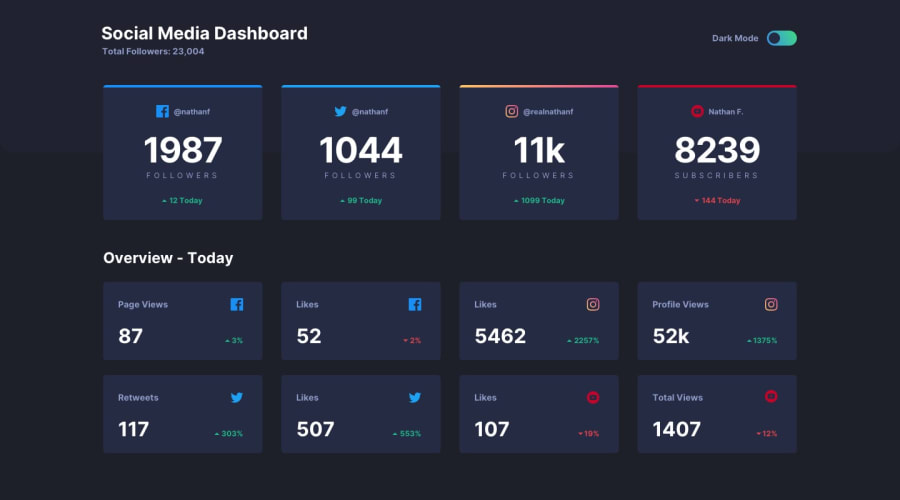
Design comparison
SolutionDesign
Community feedback
- @mohammedbahniniPosted 10 months ago
Hi , your solution looks great , one thing I've noticed it's a little bit broken for tablet target , otherwise , you did a great job .
Marked as helpful1@nsimba15Posted 10 months ago@mohammedbahnini , THANKS FOR THE COMMENT, I'M NEW AND I'M DOING MY BEST... CAN YOU GIVE ME SOME ADVICE ABOUT MEDIAQUERIES?? FOR DEVICES LIKE TABLET, AND SMALL...
0@mohammedbahniniPosted 10 months ago@nsimba15 Well , just to be honest there are a lot of ways to do the same task , not just one , I am gonna tell you the way i work :
- Defining breakpoints values ( you can look for the values in frameworks like Bootstrap , or anything else
- I always start with desktop target , then tablet then mobile
- Order the css from larger screen to the smallest one
- In my case I use sass , so with mixins its a lot easier than raw css .
I hope these notes would be useful for you .
Marked as helpful1
Please log in to post a comment
Log in with GitHubJoin our Discord community
Join thousands of Frontend Mentor community members taking the challenges, sharing resources, helping each other, and chatting about all things front-end!
Join our Discord
