

Design comparison

Community feedback
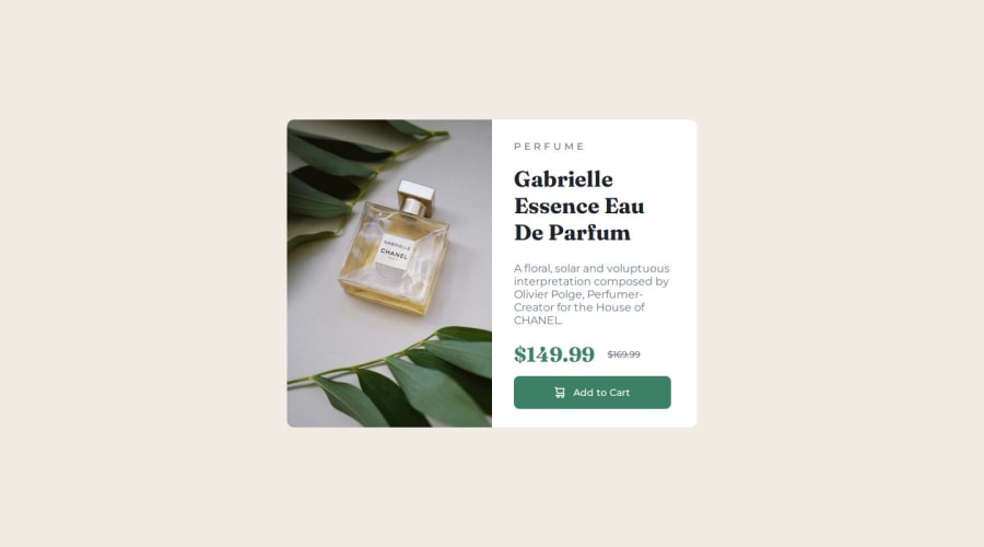
- @ardolynk-rebornPosted 2 months ago
Looks nice. However, the main font (not only subtitle) should be sized to 14px. Also the title text looks too sparsed (should have
line-height: 1).0 - P@Oliko136Posted 2 months ago
Hello!
Great job, your solution looks very close to the design!
However, your choice of some tags could be better, in my opinion. For instance, you do not need a figure tag to contain an image, as it would better be suited for illustrations or diagrams. Furthermore, the image in this card is a content image, not a decorative one, therefore it should not be added as background-image in CSS. Instead, to make a browser select a corresponding image based on device width, you can use a picture tag (https://www.w3schools.com/tags/tag_picture.asp).
I hope it helps, good luck in your future projects!
And sorry for so many "image" words, but it was necessary))
0


Please log in to post a comment
Log in with GitHubJoin our Discord community
Join thousands of Frontend Mentor community members taking the challenges, sharing resources, helping each other, and chatting about all things front-end!
Join our Discord