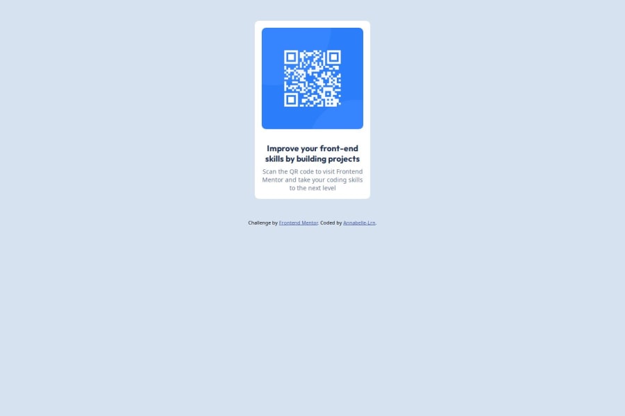
Design comparison
Solution retrospective
I tried to apply comments received on previous challenge (using rem instead of px, BEM methodology). probably create a reset css sheet if the project is larger.
Community feedback
- @tailor-made-godPosted 7 months ago
Always put alt text in an image, except if its an icon. And always specify the width and height of an image.
Your css styles looks pretty good and super readable.
Your code is great. but inside the div Elements try to use flex instead of grid. In my case its is easy with flex to deal with inside elements.
Marked as helpful0
Please log in to post a comment
Log in with GitHubJoin our Discord community
Join thousands of Frontend Mentor community members taking the challenges, sharing resources, helping each other, and chatting about all things front-end!
Join our Discord
