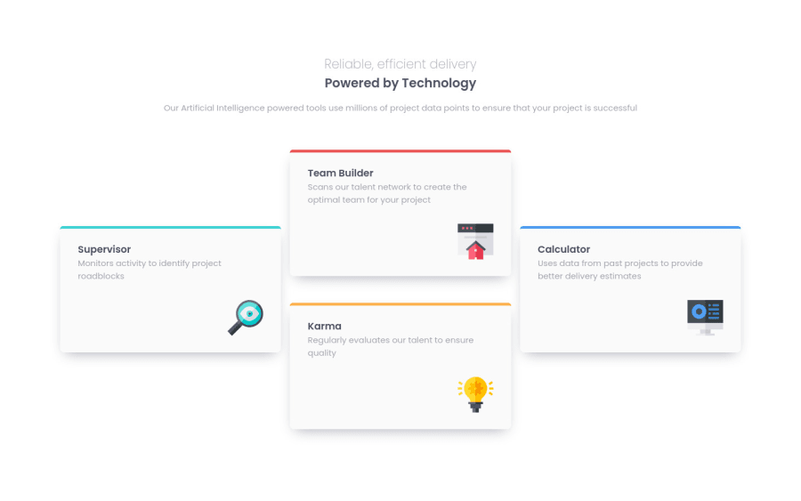
Design comparison
SolutionDesign
Solution retrospective
it was a good experience. What did you find difficult while building the project? Which areas of your code are you unsure of? Do you have any questions about best practices?
Community feedback
- @correlucasPosted about 2 years ago
Hey Nikita, I saw your solution and everything seems fine, the mobile and desktop version are fully responsive. Two things you can change are:
1.Reduce the
opacityto make the box-shadow smoother, with a value around 20%.2.Wrap each card with
articleinstead of div to improve the semantic.There rest is really good done, I'm impressed how much you've improved since your first challenge. Keep posting amazing content =)
Marked as helpful1
Please log in to post a comment
Log in with GitHubJoin our Discord community
Join thousands of Frontend Mentor community members taking the challenges, sharing resources, helping each other, and chatting about all things front-end!
Join our Discord
