Design comparison
SolutionDesign
Community feedback
- @BoffdubPosted 5 months ago
Nicely done!
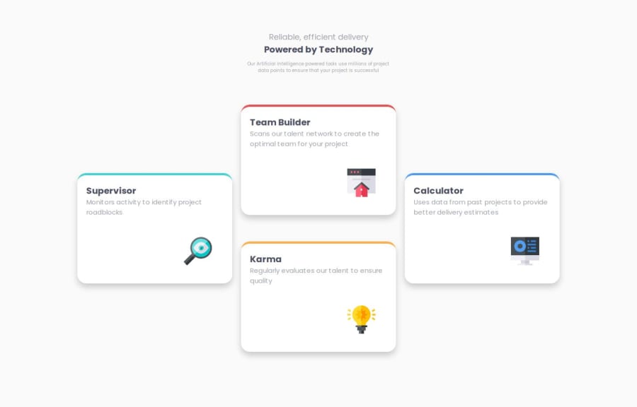
However, I didn't like the fact that when you hover over a card, the other cards blur out. But I suppose that's up to interpretation.
0
Please log in to post a comment
Log in with GitHubJoin our Discord community
Join thousands of Frontend Mentor community members taking the challenges, sharing resources, helping each other, and chatting about all things front-end!
Join our Discord
