

Design comparison
SolutionDesign

Community feedback
- @mbank14Posted 3 months ago
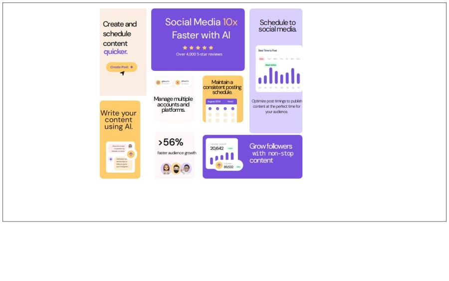
Hello, it seems like you might have missed creating the mobile version. Also, for the desktop version, the size appears a bit small when viewed across different browsers. Additionally, some elements or components, like the yellow card positioned at the bottom left, have insufficient white space—either too tight or too close to the edges of the component. Overall, great work!
0

Please log in to post a comment
Log in with GitHubJoin our Discord community
Join thousands of Frontend Mentor community members taking the challenges, sharing resources, helping each other, and chatting about all things front-end!
Join our Discord