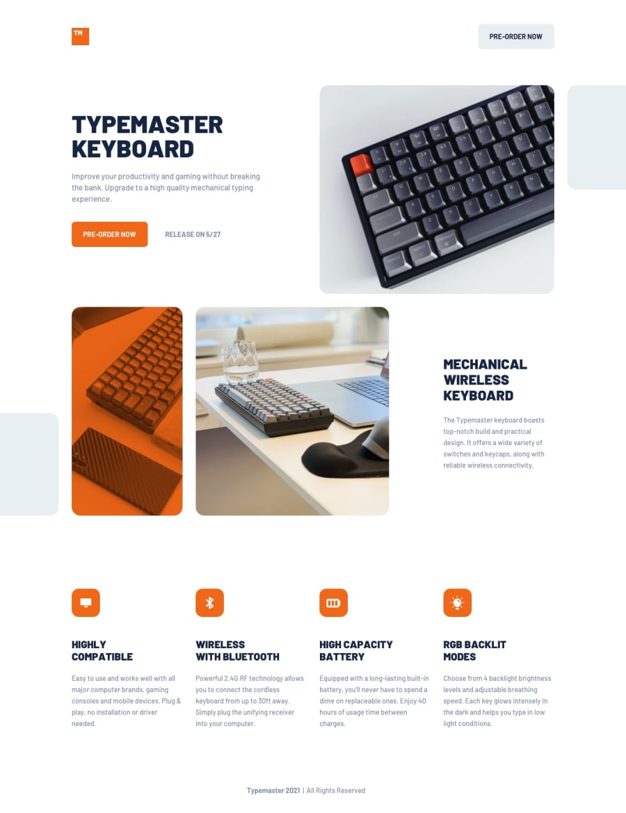
Design comparison
SolutionDesign
Solution retrospective
Okay I have to say that I love this design, it's so clean but fun and modern!
Great grid practice as advertised :D I would love to add some animations to it, I feel like it could use some movement - but while adding animation with GSAP is pretty straightforward, designing it to look good is a whole other story. If you have any advice, let me know!
I used vw to set the font size on smaller screens (the heading was overflowing the viewport), could I have done it another way?
Any other feedback will be very welcome!
Community feedback
Please log in to post a comment
Log in with GitHubJoin our Discord community
Join thousands of Frontend Mentor community members taking the challenges, sharing resources, helping each other, and chatting about all things front-end!
Join our Discord
