Not Found
Not Found
Not Found
Not Found
Not Found
Not Found
Not Found
Not Found
Not Found
Not Found
Not Found
Not Found
Not Found
Not Found
Not Found
Not Found
Not Found
Not Found
Not Found
Not Found

Submitted

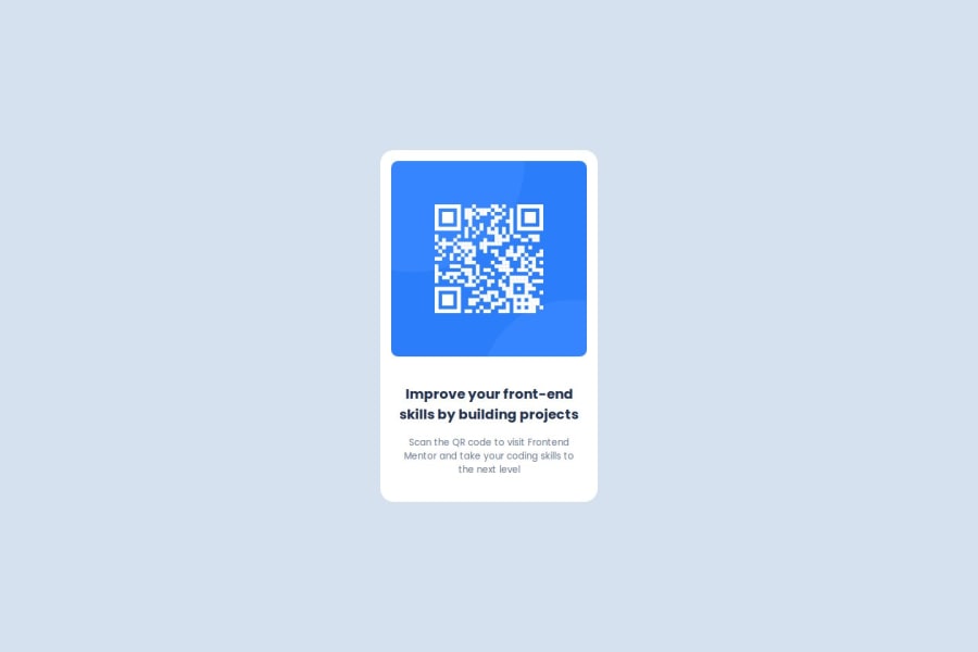
CSS for styling a QR code component

@luisgustavogorniak

Desktop design screenshot for the QR code component coding challenge

This is a solution for...

  • HTML
  • CSS
1newbie
View challenge

Design comparison


SolutionDesign

Solution retrospective


What are you most proud of, and what would you do differently next time?

It was a simple template, just created some CSS rules and it worked well.

What challenges did you encounter, and how did you overcome them?

Couldn't find the specs of the fonts, sent the repo anyway.

Community feedback

@DylandeBruijn

Posted

@luisgustavogorniak

Hiya! 👋

Congratulations on your solution, it looks very close to the design! I can tell you put a lot of effort into it.

Things you could improve ✍️

  • I suggest adding a bit of padding to your body element so the card has some space around it on smaller viewports.

  • You could add a min-height: 100vh to your body element so it takes up the full height of the viewport while still being able to grow when the content inside it grows.

  • Try experimenting with CSS variables, they help you make your CSS values more reusable across your code.

  • I suggest using clear descriptive CSS classes like .card, .card-title and .card-description.

  • Try using semantic HTML elements like main, section and article.

  • Try using using relative CSS units like rem and em they make your layout more adaptable.

  • Be careful with setting a fixed width and height on your elements. If the content in these elements grows beyond these restrictions you’ll run into overflow issues. Keeping the height at auto - which block elements are by default - will be fine in most cases.

  • You have a bit of placeholder text at the top of your solution which breaks your layout.

I hope you find my feedback helpful! 🌟

Let me know if you have more questions and I'll do my best to answer them. 🙋‍♂️

Happy coding! 😎

Marked as helpful

1

@luisgustavogorniak

Posted

Thank you so much for your feedbak! I really appreciate it! Did some changes as you suggested, it looks a little closer now. It still needs more work on the margin and padding of the card elements I guess.

0

Please log in to post a comment

Log in with GitHub
Discord logo

Join our Discord community

Join thousands of Frontend Mentor community members taking the challenges, sharing resources, helping each other, and chatting about all things front-end!

Join our Discord