CSS Flexbox, variables, media queries, overflow and more


Design comparison

Solution retrospective
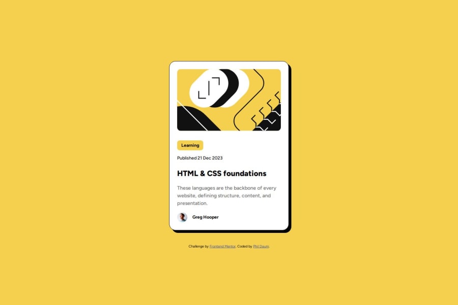
I am most proud of figuring out how to get the image overflow to crop off on the right side between the desktop and mobile versions, all while maintaining the rounded edges.
I did this by putting the image in a container. I applied the following CSS properties to the image's container:
.card .main-image-container {
    overflow: hidden;
    border-radius: .75rem;
}
and this to the image itself at small screen sizes:
@media (max-width: 650px) {
    .card {
        width: 20.5rem;
    }
    .card .main-image {
        max-width: 200%;
        width: 120%;
        height: auto;
      }
}
I was also able to come up with a solution to the challenge "reduce font size for smaller screens without using media queries". I discovered an interesting CSS property called 'clamp', it acts as a clamp, stopping a variable unit with a maximum and minimum size. I used it on my text-preset-02 class as shown here:
.text-preset-02 {
  font-size: clamp(.8rem, 2vw, calc(14 / 16 * 1rem));
  line-height: 1.5;
  letter-spacing: 0;
  font-weight: 500;
}
Next time, I would like to figure out how to import the fonts using @font-face
What challenges did you encounter, and how did you overcome them?I did not figure out how to use the local font files. I tried the following syntax with @font-face and it was not working:
@font-face {
    font-family: "Figtree";
    src: url("assets/fonts/Figtree-VariableFont_wght.ttf") format("truetype");
}
My solution was to import the same font from Google fonts
What specific areas of your project would you like help with?I would like help:
- Learning how to use @font-face
- Better organizing my CSS classes
- How exactly do I use the 'Spacing' section at the bottom of the Figma Design System page? How do I know what areas of the design this corresponds to?

Join our Discord community
Join thousands of Frontend Mentor community members taking the challenges, sharing resources, helping each other, and chatting about all things front-end!
Join our Discord