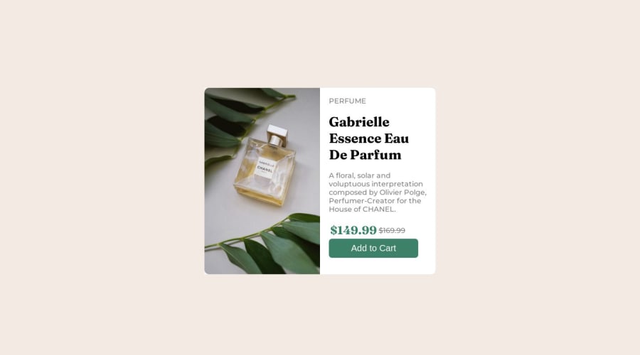
Design comparison
Solution retrospective
While building the project, I didn't find any significant difficulties. However, I would say that one area that required careful attention was ensuring a responsive layout for different screen sizes. I had to use CSS media queries and adjust the styles accordingly to make the website display properly on various devices.
Regarding the code, I'm confident about its implementation and functionality. I have thoroughly reviewed and tested it to ensure it meets the desired requirements.
As for best practices, I've followed standard practices such as using proper HTML structure, separating styles into a CSS file, and utilizing media queries for responsive design. However, if you have any specific questions about best practices or suggestions for improving the code, I would be happy to discuss and provide further guidance.
Community feedback
Please log in to post a comment
Log in with GitHubJoin our Discord community
Join thousands of Frontend Mentor community members taking the challenges, sharing resources, helping each other, and chatting about all things front-end!
Join our Discord
