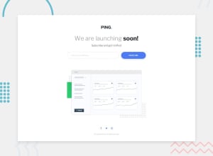
Design comparison
Solution retrospective
I will be happy to hear any feedback and suggestion!!!
Community feedback
- @boedegoatPosted over 2 years ago
Great work @AditNovadianto. Congratulations for finishing another challenges.
Some of your issues have been explained by @Prabhash Ranjan. So I suggest you to learn more about the usage of
max-widthto make your layout more responsive.Other than that, keep it up and enjoy coding !
Marked as helpful1@AditNovadiantoPosted over 2 years ago@boedegoat Thankyou @boedegoat for your advice!!!
0 - @besttlookkPosted over 2 years ago
Hi, Everything looks great. There are few things i like to point out:
- on Focing the input the rest of the UI shifts a bit. That is because you have added border on focus. To avoid that shift add border on normal state too but with transparent color.
2.You should wrap the content with some wrapper as in some breakpoints content is touching the screen, also input and button are not aligned to the center . This is what i do normally
main { width: 90vw; max-width:1280px; margin-inline: auto; } @media (min-width:1200px){ main{ padding-inline: 1rem; } }- Add error state when user click on "notify me" without adding any url
Good Luck
Happy Coding
Marked as helpful1@AditNovadiantoPosted over 2 years ago@besttlookk thankyou for your advice and i will fix it!!!
1
Please log in to post a comment
Log in with GitHubJoin our Discord community
Join thousands of Frontend Mentor community members taking the challenges, sharing resources, helping each other, and chatting about all things front-end!
Join our Discord
