

Design comparison

Community feedback
- @HassiaiPosted over 1 year ago
Replace<div class="container">with the main tag, <h3> with <h1> , <h4> with <p> and <div class="attribution"> with the footer tag to make the page accessible. click here for more on web-accessibility and semantic html
Every html must have <h1> to make it accessible. Always begin the heading of the html with <h1> tag wrap the sub-heading of <h1> in <h2> tag, wrap the sub-heading of <h2> in <h3> this continues until <h6>, never skip a level of a heading.
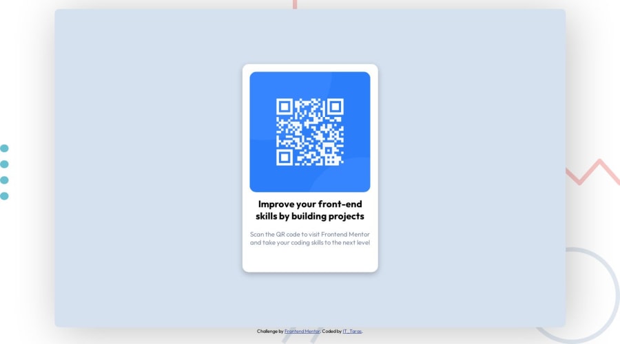
There is no need to style .container , .wrapper, .line-circle-dot__bg and .qr__card
Give the body a background-color of light-gray. Use the colors that were given in the styleguide.md found in the zip folder you downloaded.
For a responsive content,
- Replace thw width in .qr__code-component with max-width and the height with a padding value for all the sides
max-width: 320px which is 20rem/em padding:16px which is 1rem/em - Give the img a max-width of 100% and a border-radius value, the rest are not needed.
Give .qr__card-title a margin value for all the sides and text-align: center . Give p a margin-top or h1 a margin-bottom value for the space between the text.
To center .qr__code-component on the page using flexbox, add min-height:100vh; display: flex; align-items: center: justify-content: center; to the body
body{
min-height: 100vh;
display: flex;
align-items: center;
justify-content: center;
}
Use relative units like rem or em as unit for the padding, margin, width values and preferably rem for the font-size values, instead of using px which is an absolute unit. For more on CSS units Click here and here
Hope am helpful.
Well done for completing this challenge. HAPPY CODING
Marked as helpful0 - Replace thw width in .qr__code-component with max-width and the height with a padding value for all the sides
- @khushi0909Posted over 1 year ago
1)Read about h1 tag its the most important and every website should have atleast one https://www.semrush.com/blog/h1-tag/
2)now it looks good on every screen ,but you may read about media queries for responsiveness for the future
3)you have implemented the semantics html ,that good
All the best :-)
Marked as helpful0


Please log in to post a comment
Log in with GitHub
Join our Discord community
Join thousands of Frontend Mentor community members taking the challenges, sharing resources, helping each other, and chatting about all things front-end!
Join our Discord