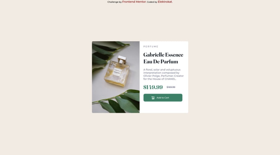
Design comparison
Solution retrospective
Hello, good day, the issue i had is with the mobile version, it had a different image and i don't know how to add it when using a media query, i just had to use the desktop image. Thank you in anticipation
Community feedback
- @correlucasPosted over 2 years ago
👾Hello Edwin, congratulations for your first solution and 😎 welcome to the Frontend Mentor Coding Community!
Your component structure is already good, but you need to fix some specs, for example, the container size is a little bit bigger, is
max-width: 900;xand the image isn't scaling proper with the container and is losing its proportions, to fix that you can apply some fixes to the image selector, see the corrections below:img { display: block; object-fit: cover; max-width: 100%; }
👋 I hope this helps you and happy coding!
Marked as helpful0 - @VCaramesPosted over 2 years ago
Congrats on completing this project!
There are two ways you can accomplish the image situation.
The first is using the <Picture> Element using this template.
This article will explain the picture method in detail: https://www.w3schools.com/tags/tag_picture.asp
The second option is using Media Queries.
In your main code, you'll use the Background-Image (url) property to add your image then you'll create a query using the same property buy with the image you want it to change to.
This article, will go into detail for both methods:
https://css-tricks.com/responsive-images-css/
Marked as helpful0
Please log in to post a comment
Log in with GitHubJoin our Discord community
Join thousands of Frontend Mentor community members taking the challenges, sharing resources, helping each other, and chatting about all things front-end!
Join our Discord
