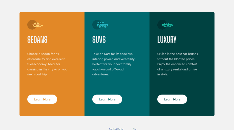
Design comparison
SolutionDesign
Solution retrospective
Any feedback is appreciated, thank you!
Community feedback
- @vanzasetiaPosted about 3 years ago
Hi, Matt! 👋
Great work on this challenge! Your solution looks pretty good! It's great that all elements live inside the correct landmark. Awesome! 👏
There are three things that I would suggest,
- Firstly, always use interactive elements for any elements that have
:activeand/or:hovereffects. Also, keep in mind that text content should always be wrapped by a meaningful element. However, it's okay to wrap the text withspanordivas long as the main wrapper is a meaningful element. - Secondly, not all images need alternative text. Images without alternative text are called decorative elements which mean that without those images, the user still be able to interact with the site. In this case, all car icons are decorative so leave the
alt=""empty. - Thirdly, write the styling using the mobile-first approach. It often leads to shorter and better performance code. Also, mobile users won't be required to process all of the desktop styles.
That's it! Hope you find this useful! 😁
0 - Firstly, always use interactive elements for any elements that have
Please log in to post a comment
Log in with GitHubJoin our Discord community
Join thousands of Frontend Mentor community members taking the challenges, sharing resources, helping each other, and chatting about all things front-end!
Join our Discord
