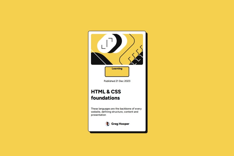
Design comparison
Solution retrospective
how i could relate to my codeeasily and applying the things i learnt in the previous challenge
What challenges did you encounter, and how did you overcome them?i could not put shadows on my container. i lso couldnt align an object to the left. i managed to browse through the internet and get solutions
What specific areas of your project would you like help with?aligning objects
Community feedback
- @AhmedAtef32Posted 2 days ago
You did it well. My advice to you is not to use width as px and not to use text center in the container. And use semantic tags to make performance better.
0 - @UnifiesPosted 3 days ago
Hi again, I promise I'm not stalking you lol - I just keep getting your solutions for peer review in this learning path.
Nice work completing the project!
Some feedback for you:-
The alignment on your solution is off, it looks greatly different from the design. The content is supposed to align to the left, not center.
There's an extra padding in the "Learning"'s padding - include
display: flex;
to the "box" div containing Learning and see if that works correcting the extra paddingTip: This challenge comes with a free Figma Design File and it greatly helps in getting the correct values for the widths, spaces, font sizes, font weights, border radius [practically every info you'll need to match the design exactly] and it fastens the coding process as there's less guess work or trial and errors.
0
Please log in to post a comment
Log in with GitHubJoin our Discord community
Join thousands of Frontend Mentor community members taking the challenges, sharing resources, helping each other, and chatting about all things front-end!
Join our Discord