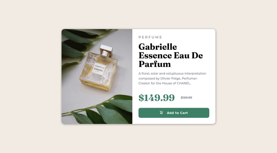
Design comparison
Solution retrospective
I want to know more about these kind of projects, do you guys solve it using flexbox, or do you use css grid? And I also want to know the reason for it? Why do you think it's a good solution for this? Shoot your comments! I will be happy to read feedback.
Community feedback
- @VCaramesPosted about 2 years ago
Hey @Zdravko93, regarding your question:
You can use either. But most people use grid since it is an advance version of flex.
Some suggestions to improve you code:
- For this challenge you want to use the Picture Element not the Background Image Property. The Background Image Property is mainly used on decorative images
Picture Element will allow your to switch between images in different breakpoints and makes your site load faster by saving bandwidth.
Here is an example of how it works: EXAMPLE
Syntax:
  <picture>
    <source media="(min-width: )" srcset="">
    <img src="" alt="">
  </picture>
More Info:
https://www.w3schools.com/html/html_images_picture.asp
https://web.dev/learn/design/picture-element/
-
Once you fix the image implementation, you'll want to include an Alt text tag with them. Inside that Alt Tag you want to describe what the image is; they need to be readable. Assume you’re describing the image/icon to someone.
-
The old price 🏷 is not being announced properly to screen readers. You want to wrap it in a Del Element and include a sr-only text explaining that this is the old price.
Happy Coding! 👻🎃
Marked as helpful1@Zdravko93Posted about 2 years ago@vcarames Thank you! You have been most helpful in your feedback! I will have that all in mind for the next project!
0
Please log in to post a comment
Log in with GitHubJoin our Discord community
Join thousands of Frontend Mentor community members taking the challenges, sharing resources, helping each other, and chatting about all things front-end!
Join our Discord
