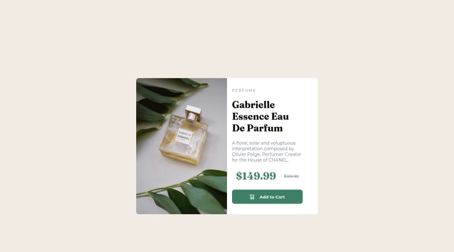
Design comparison
Solution retrospective
If you give some FeedBack you'll really make me happy. I've tried my best but for getting better i need your FeedBack.
Community feedback
- @correlucasPosted about 2 years ago
👾Hello , Congratulations on completing this challenge!
Your solution its almost done and I’ve some tips to help you to improve it:
1.Using
<picture>
you’ve more control over the elements and its better than using the product image as<img>
orbackground-image
. Look that for SEO and search engine reasons it isn't a better practice to import this product image with CSS since this will make it harder to the image. You can manage both images inside the<picture>
tag and use the html to code to set when the images should change setting the devicemax-width
depending of the device (phone / computer) Here’s a guide about how to usepicture
:https://www.w3schools.com/tags/tag_picture.asp
2.Use units as
rem
orem
instead ofpx
to improve your performance by resizing fonts between different screens and devices.To save your time you can code your whole page using
px
and then in the end use a VsCode plugin called px to rem here's the link → https://marketplace.visualstudio.com/items?itemName=sainoba.px-to-rem to do the automatic conversion or use this website https://pixelsconverter.com/px-to-rem3.Add transitions to make the interaction smoother while the element gets hovered, you can use a value like
transition: all ease-in 0.5s
.4.Use a CSS reset to avoid all the problems you can have with the default CSS setup, removing all margins, and making the images easier to work, see the article below where you can copy and paste this CSS code cheatsheet: https://piccalil.li/blog/a-modern-css-reset/
✌️ I hope this helps you and happy coding!
Marked as helpful1@toprakunalPosted about 2 years ago@correlucas Thank you! that px to rem plugin and CSS reset is very helpful
1 - @Deepanshu-5288Posted about 2 years ago
Hello @toprakunal It's really good but I have a little suggestion.
- The approach you've used to center this card vertically is not the best way. Since you have used flex in the container class as well as align-content : center then add on this min-height : 100vh it will always make ur card always center for the container so you no need to give margin-top in card class like this
.container{ min-height: 100vh; margin: 0; text-align: center; display: flex; align-items: center; justify-content: center; )
It will give you much more control over your card rather than using a margin-top.
- For changing image when screen size changes from desktop to mobile you can picture tag pls refer to below link:https://www.w3schools.com/html/html_images_picture.asp
I hope it helps you, Thanks
Marked as helpful1@toprakunalPosted about 2 years ago@Deepanshu-5288 I changed my code to your suggestion and it's perfectly centered. I learned something new thank you very much for your feedback, and i'll examine your refer link (picture tag) as soon as possible.
0
Please log in to post a comment
Log in with GitHubJoin our Discord community
Join thousands of Frontend Mentor community members taking the challenges, sharing resources, helping each other, and chatting about all things front-end!
Join our Discord