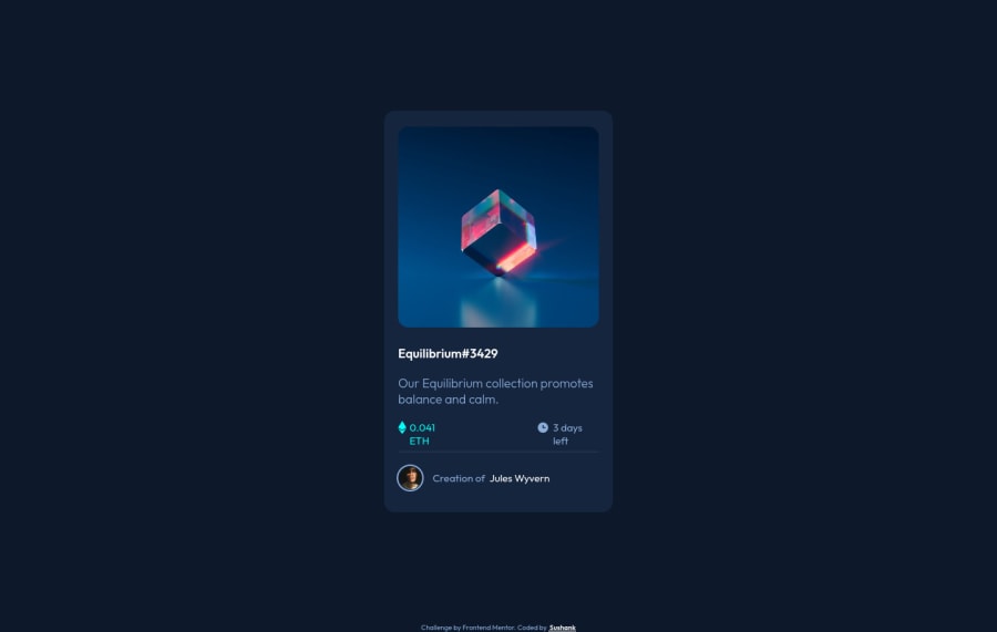
Design comparison
Solution retrospective
Overlay on the image is not polished, would love feedback on how to do it in a better and more efficient way. My code on that overlay is dirty.
Community feedback
- @NaveenGumastePosted almost 3 years ago
Hay ! Good Job you made it look nearly perfect to the preview
These below mentioned tricks will help you remove any Accessibility Issues
-> Add Main tag after body like it should be your container
-> For 1st heading or h1 tag, use header tag and then inside the header put your h1 or h2 etc
-> But use header tag only once in main heading element.
Keep up the good work!
0 - @LshirocPosted almost 3 years ago
HI👋, I took a look to your project. Your sizing looks good.
- I think you should use header(maybe h2 or h3) for Equilibrium#3429 text so it will be more big. And also headers mean the main content of the web page(these are important for google search results).
- Border of avatar image should be white(accordingly to the given images of challange) and 1px.
- And you should give a slight shadow to the card
- And you should give margin-bottom to your Equilibrium#3429 text. Because now when you move your pointer to bottom of that text then hover starts. But I reccomend you to use gap property to give spaces between components(it depends on the project and design).
Keep coding :D
0 - @nehanalinikPosted almost 3 years ago
Add alt text in the overlay image, put ur code in one container say "main"
0
Please log in to post a comment
Log in with GitHubJoin our Discord community
Join thousands of Frontend Mentor community members taking the challenges, sharing resources, helping each other, and chatting about all things front-end!
Join our Discord
