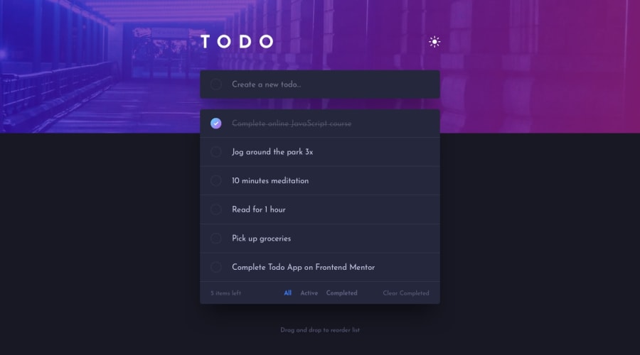
Design comparison
Community feedback
- @NaveenGumastePosted almost 3 years ago
Hay ! Good Job you made it look nearly perfect to the preview
These below mentioned tricks will help you remove any Accessibility Issues
-> Add Main tag after body like it should be your container
-> For 1st heading or h1 tag, use header tag and then inside the header put your h1 or h2 etc
-> But use header tag only once in main heading element.
Keep up the good work!
0 - @PatrickCuentasPosted almost 3 years ago
Good job, I would suggest you add javascript to give it life or better learn a framework when you feel with a good base of javascript and be able to handle the requirements that they ask for faster.
I invite you to see my solution to the same challenge made with ReactJS.
0
Please log in to post a comment
Log in with GitHubJoin our Discord community
Join thousands of Frontend Mentor community members taking the challenges, sharing resources, helping each other, and chatting about all things front-end!
Join our Discord
