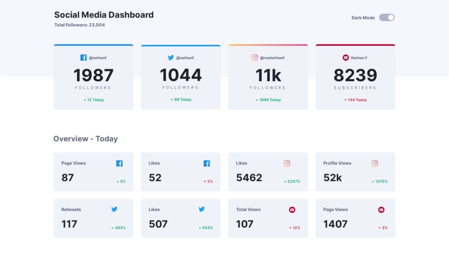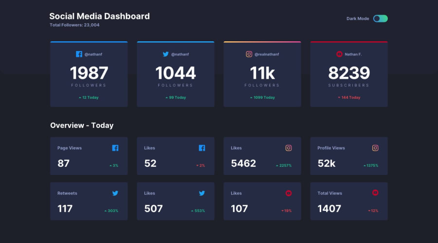
Design comparison
Solution retrospective
Any pointers on how to improve my solution. (Js performance, styling)
Community feedback
- @dpayne713Posted about 4 years ago
Nice!
Styling looks great. I don't think it's an issue so much as a preference thing.. but I wish there was a breakpoint that created 2 columns as the browser size shrinks instead of 3 with a single box below it.
I did this one recently and you might take a look at my javascript solution for another option. I thought about doing it the way you did it here and am interested to see which way is better practice.
https://www.frontendmentor.io/solutions/straight-htmlcssjs-looking-forward-to-sass-on-next-project-Y11RVwDzx
1@odkpatrickPosted about 4 years ago@dpayne713 Your solution looks awesome. Your javascript solution is so much simpler, thank you for sharing.
I used the flex-wrap property to have the 2, 3 and 4 column layout for the cards.
1
Please log in to post a comment
Log in with GitHubJoin our Discord community
Join thousands of Frontend Mentor community members taking the challenges, sharing resources, helping each other, and chatting about all things front-end!
Join our Discord
