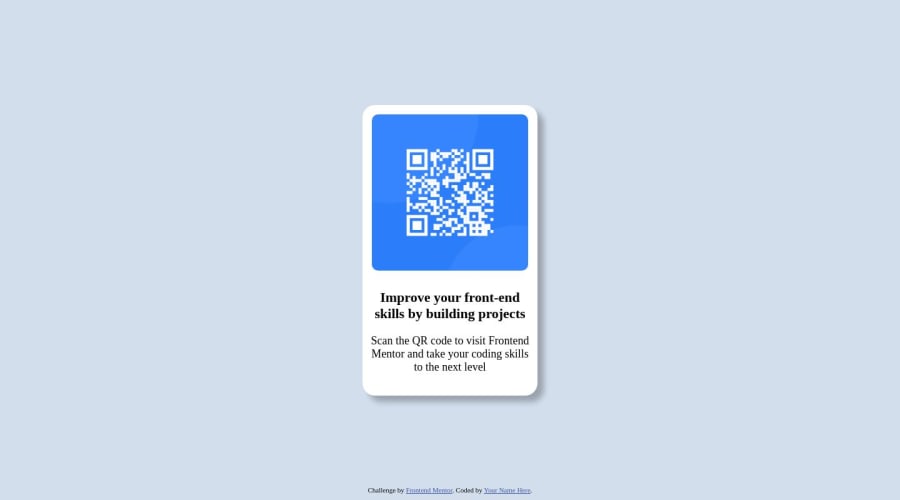
Design comparison
SolutionDesign
Community feedback
- @0xabdulkhaliqPosted over 1 year ago
Hello there 👋. Congratulations on successfully completing the challenge! 🎉
- I have other recommendations regarding your code that I believe will be of great interest to you.
QR iMAGE ALT TEXT 📸:
- Since this component involves scanning the QR code, the image is not a decoration, so it must have an
altattribute.
- The
altattribute should explain the purpose of theimage.
- E.g.
alt="QR code to frontendmentor.io"
<img src="/images/image-qr-code.png" alt="QR code to frontendmentor.io">
.
I hope you find this helpful 😄 Above all, the solution you submitted is great !
Happy coding!
Marked as helpful0 - @RogelioCamargoPosted over 1 year ago
Your solution is awesome and looks great on all devices.
What I noticed:
- Font is incorrect. In case you don't know how to use Google fonts, this is a good resource: How to use Google Fonts
- Use "min-height: 100vh" for body instead of "height: 100vh." Setting the height: 100vh may result in the component being cut off on smaller screens.
0
Please log in to post a comment
Log in with GitHubJoin our Discord community
Join thousands of Frontend Mentor community members taking the challenges, sharing resources, helping each other, and chatting about all things front-end!
Join our Discord
