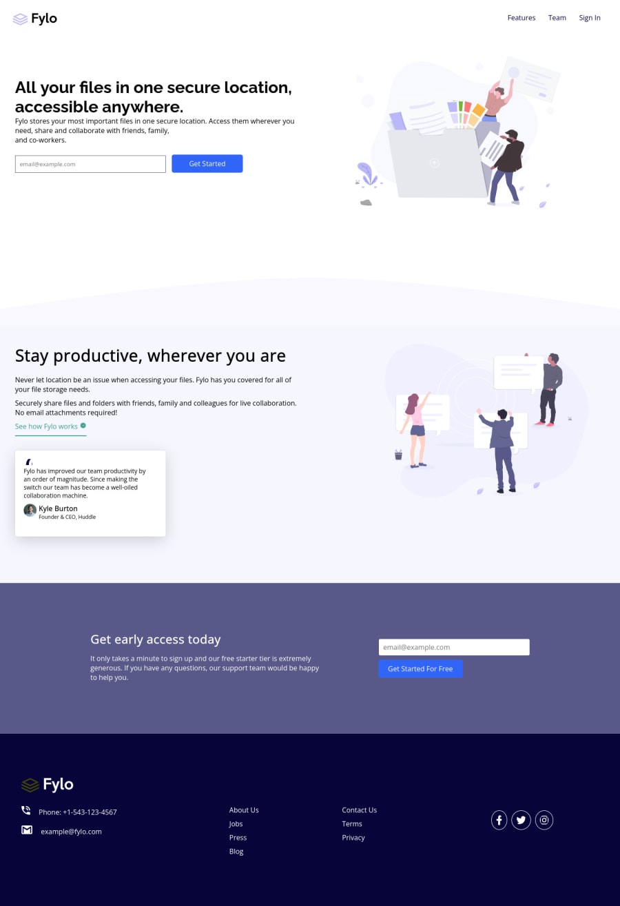
Design comparison
Solution retrospective
Please give me your valuable feedback i want to validate email but i stuck but after some time i will update this project and correct my mistake thanks
Community feedback
- @PhoenixDev22Posted over 2 years ago
Hello aman kumar ,
Congratulation on completing this challenge. I see you have already received some incredible feedback which is nice to see, just going to add some suggestions as well if you don't mind:
HTML
The logo's alternate text should not be empty. Use the website's name as an alternate text. You may set
alt=”Fylo logo"
.If you are going to leave the logo not wrapped by<a>
, it’s better to place it out the<nav>
as it does not navigate the user in anywhere(only an image)Use the
<form>
tag to wrap the<input>
and the<button>
as Get Started much likely to be a button with submit type.Forms with proper inputs and labels are much easier for people to use. To pair the label and input, one way is n explicit label’s
for
attribute value must match its input’sid
value. Input fields without accompanying labels can lead to accessibility issues for those who rely on screen readers. If a screen reader comes across an input field without a label it will try to find some accompanying text to use as the label. (To hide the label visually but present for assistive technology, you may usesr-only
class )look up a bit more about how and when to write alt text on images. Learn the differences with decorative/meaningless images vs important content like
icon-phone, icon-arrow , icon-quotes
andicon-email
are decorative. For decorative images, you set an emptyalt
to it with anaria-hidden=”true”
to remove that element from the accessibility tree. This can improve the experience for assistive technology users by hiding purely decorative images.For the alternate text of the testimonials avatar should not be empty, you can use the avatar name
alt=" kyle burton"
.Use the
<nav >
landmark to wrap the footer navigation witharia-label=”secondary “
oraria-label=”footer”
. A brief description of the purpose of the navigation, omitting the term "navigation", as the screen reader will read both the role and the contents of the label. Thenav
element in the header could use anaria-label="primary"
oraria-label=”main”
attribute on it. The reason for this is that, You should add thearia-label
for a nav element if you are using the nav more than once on the page.you can read more in MDN- For the testimonial , you may use
<blockquote>, <figure>, <figcaption>
You may use the
<address>
tag to wrap the contact information for the author/owner of a document or an article (email and phone number.)Never use
<div>
alone to wrap a meaningful content. Just keep in mind that you should usually use semantic HTML in place of the div tag unless none of them (the semantic tags) really match the content to group together.* By adding semantic tags to your document, you provide additional information about the document, which aids in communication.- For the reason stated before, instead of using a generic
div
, Use the<ul>
to wrap the social links .It should look like this:
<ul class="social"> <li class=""><a href="#" aria-label="Visit our facebook"> <<img src="images/icon-facebook.svg" alt="" aria-hidden="true" /></a></li> <li class=""><a href="#" aria-label="Visit our twitter"> <img src="images/icon-twitter.svg" alt="" aria-hidden="true"/></a></li> <li class=""><a href="#" aria-label="Visit our instagram"> <img src="images/icon-instagram.svg" alt="" aria-hidden="true"/></a></li> </ul>
The social links wrapping the icons must have
aria-label
orsr-only
text indicate where the link will take the user. Then you setaria-hidden =”true”
to the icons to be ignored by assistive technology.Aside these , you did great work. Hopefully this feedback helps.
Marked as helpful1 - For the testimonial , you may use
- @DavidMorgadePosted over 2 years ago
Hello and congratulations finishing this challenge!
For a simple email validator you need to do it on your Javascript file, select your text
input
and yoursubmit
, and with a regular expression (you can check them on google/stackoverflow) you can validate any type of email that you put in your input when clicking the submit button if the email isnt valid, add some type of alert or for example a red border class to the input that alerts the user that the email isn't valid.For example you can do something like this (don't take this as a direct solution to your code, add this classes to your input and try with your own code!)
const inputText = document.querySelector('.input__text'); const inputSubmit = document.querySelector('.input__submit'); const regex = /* Your email regex here */ const emailValidation = () => { inputSubmit.addEventListener('click', () => { if(inputText.value ==! regex) return alert('invalid email address!, please enter a valid one') }) }
This is just a fast example that I made here and didn't try so I don't know if it would work or not, but you can get an approach with this example!
Hope my answer helps you!
Marked as helpful1@amankumar1222Posted over 2 years ago@DavidMorgade thanks bro for your feedback and your valuable time i will update my challenge
1 - @SurajHadagePosted over 2 years ago
You don't even need Javascript or other programming language to validate your email input. You just need to understand how browsers read and understand input fields like how browser saves information about user. I would recommend you to use this structure of HTML :
<form> <input type="email" id="email1" placeholder="Enter your email..." required> <input type="submit" value="Get Started"> </form>
- This way your browser will validate your input field.
- I would recommend you to not upload unnecessary folders & files to save server space.
1
Please log in to post a comment
Log in with GitHubJoin our Discord community
Join thousands of Frontend Mentor community members taking the challenges, sharing resources, helping each other, and chatting about all things front-end!
Join our Discord