
Solution retrospective
What are you most proud of, and what would you do differently next time?
I feel I did a decent job. Feedback is welcome
What challenges did you encounter, and how did you overcome them?Moving from mobile first to desktop layout was slightly difficult.
What specific areas of your project would you like help with?Tips on how to write better css
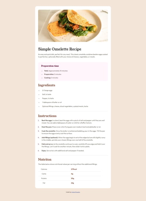
Code
Loading...
Please log in to post a comment
Log in with GitHubCommunity feedback
No feedback yet. Be the first to give feedback on Celeste Rhoades's solution.
Join our Discord community
Join thousands of Frontend Mentor community members taking the challenges, sharing resources, helping each other, and chatting about all things front-end!
Join our Discord