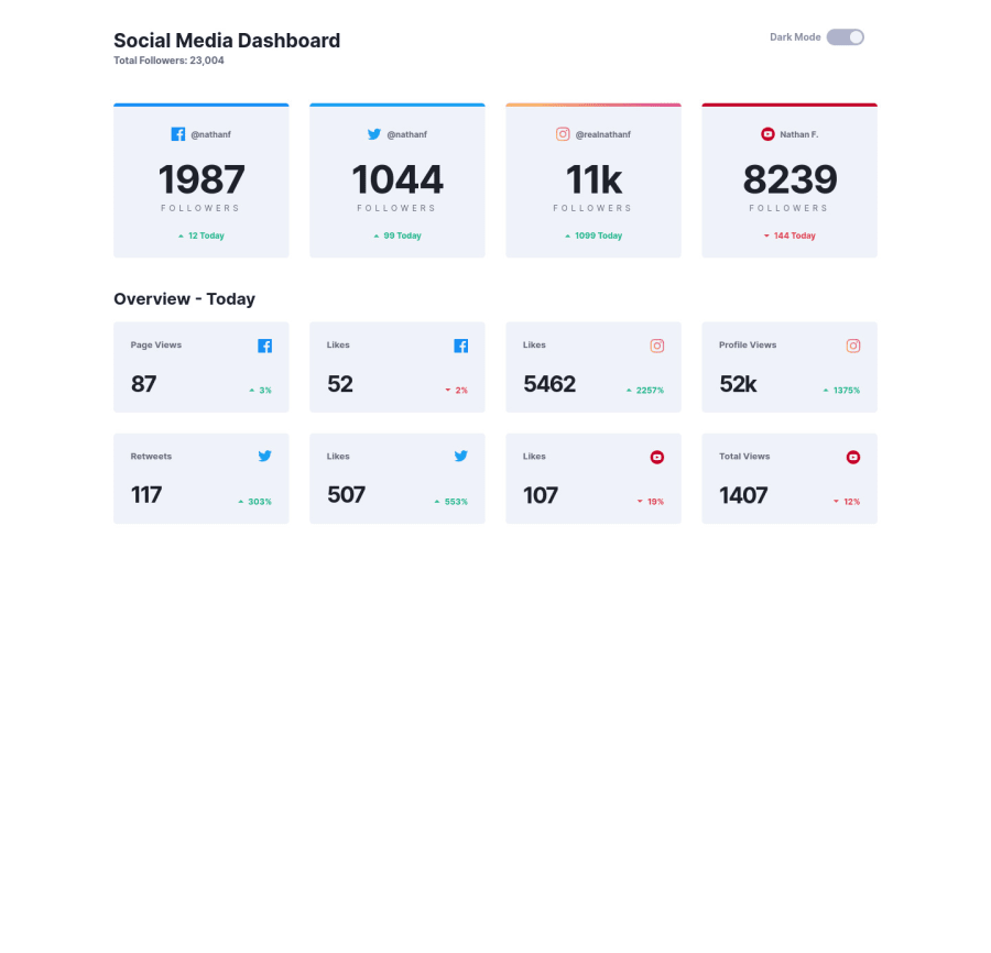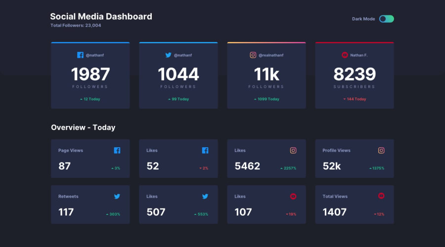
Design comparison
Solution retrospective
Hi, I managed to finish this project, but the colour change button was really a big challenge for me. I used the internet and youtube to a large extent. In this project I finally convinced myself to create separate components for my site. Unfortunately, using the sass compiler I had problems firing them up, but I promised myself that I would install Gulp.
I hope you guys like my version. If you have constructive comments feel free to write , good luck !
Community feedback
- @sahand-masolehPosted about 2 years ago
Hey Jerry! Good job!
First things first, you have set a
min-height: 150vhon your page, I'm guessing you meant to do 100vh to be able to center the content on the page. But even then, that's the wrong approach, vh units include the address bar on mobile browsers and it will push everything down. Useheight: 100%on html and body elements and then you can use percentage units to maximize the main container withmin-height: 100%Regarding the theme toggle, I think a checkbox would've been a better choice than two radio buttons, both for you and for the user. It's a tad bit hard to click on right now.
Marked as helpful0 - @JerryWskiPosted about 2 years ago
thx for tips. did some tweaks and toggle button should be better clickable :)
1
Please log in to post a comment
Log in with GitHubJoin our Discord community
Join thousands of Frontend Mentor community members taking the challenges, sharing resources, helping each other, and chatting about all things front-end!
Join our Discord
