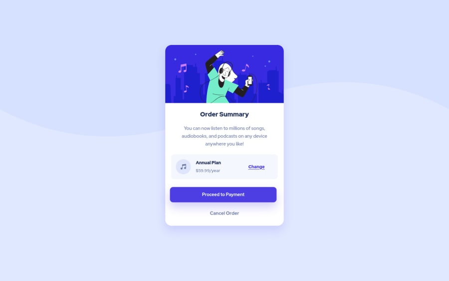
Design comparison
SolutionDesign
Community feedback
- @atif-devPosted almost 2 years ago
Hi guinhooliveira, congrats🎉 on completing the challenge. Better take care about following points.
- Always check Frontendmentor Report Generator issues after submitting the project for removing errors and warnings. To avoid accessibility issue "All page content should be contained by landmarks" use code as :
<body>
    <main>
        ---your code here----
    </main>
  <footer>
  </footer>
</body>
(why
mainmatters? Read here)- For centering the container(whole card) vertically and horizontally you can use code as:
body {
    min-height: 100vh;
    display: grid;
    place-content: center;
}
(In your code add above block of code and remove
margin: 144px auto;from.containerselector for proper centering)(Have any questions🧪?reply to this message😇)
Hope you will find this Feedback Helpful.😇
0
Please log in to post a comment
Log in with GitHubJoin our Discord community
Join thousands of Frontend Mentor community members taking the challenges, sharing resources, helping each other, and chatting about all things front-end!
Join our Discord
