CSS flexbox, CSS transition, HTML button, CSS border-radius


Design comparison

Solution retrospective
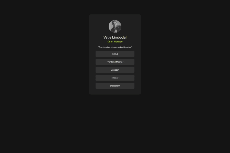
The only real challenge I faced with this project was getting the "main" div to center in the body, not sure how to center them other than using padding or flexbox. The main problem however was getting the transitions like in the example to be so smooth and responsive. My button background-color change are so unresponsive in comparison to the solution. Is it because I'm using the button property, or is it something else? I don't think its the transition speed either, because that matches pretty good, its just that they are not as responsive.
What specific areas of your project would you like help with?Getting responsive buttons
Community feedback
- @StroudyPosted 2 months ago
Amazing job with this! You’re making fantastic progress. Here are some small tweaks that might take your solution to the next level…
- I would put these into a
<ul> <li>, and the text should be wrapped with a<a>so it is accessible with a keyboard using the tab key, Using an<a>tag for navigation is semantically correct, improves accessibility for screen readers, and ensures consistent behavior across browsers, unlike a<button>or a<div>not intended for links.
<div class="button-container"> <button>GitHub</button> <button>Frontend Mentor</button> <button>LinkedIn</button> <button>Twitter</button> <button>Instagram</button> </div>-
Using a full modern CSS reset is beneficial because it removes default browser styling, creating a consistent starting point for your design across all browsers. It helps avoid unexpected layout issues and makes your styles more predictable, ensuring a uniform appearance on different devices and platforms, check out this site for a Full modern reset
-
While
pxis useful for precise, fixed sizing, such asborder-width,border-radius,inline-padding, and<img>sizes, it has limitations. Pixels don't scale well with user settings or adapt to different devices, which can negatively impact accessibility and responsiveness. For example, usingpxfor font sizes can make text harder to read on some screens, Check this article why font-size must NEVER be in pixels. In contrast, relative units likeremandemadjust based on the user’s preferences and device settings, making your design more flexible and accessible. Usepxwhere exact sizing is needed, but prefer relative units for scalable layouts. If you want a deeper explanation watch this video by Kevin Powell CSS em and rem explained. Another great resource I found useful is this px to rem converter based on the default font-size of 16 pixel. -
For future project, You could download and host your own fonts using
@font-faceimproves website performance by reducing external requests, provides more control over font usage, ensures consistency across browsers, enhances offline availability, and avoids potential issues if third-party font services become unavailable. Place to get .woff2 fonts
You’re doing fantastic! I hope these tips help you as you continue your coding journey. Stay curious and keep experimenting—every challenge is an opportunity to learn. Have fun, and keep coding with confidence! 🌟
Marked as helpful0 - I would put these into a
- @mananqayasdevPosted 2 months ago
The design looks good, you can use align-items center to position the container in the center of screen. Also the Jessica Randall should be bold.
Use relative units for fonts and spacing, use rem for font sizes and spacings. Use unit less for line heights.
Marked as helpful0


Please log in to post a comment
Log in with GitHub
Join our Discord community
Join thousands of Frontend Mentor community members taking the challenges, sharing resources, helping each other, and chatting about all things front-end!
Join our Discord