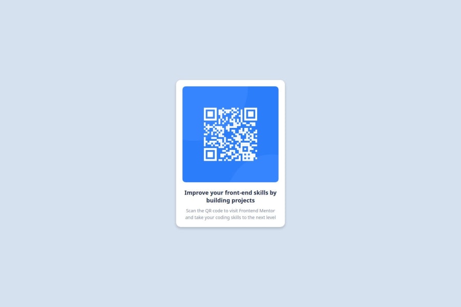
Design comparison
Community feedback
- P@aurelienfliegerPosted 5 months ago
Does the solution include semantic HTML?
You use divs for everything, instead of semantic elements.
Is it accessible, and what improvements could be made?
Setting a minimum width will prevent the card from getting crushed at smaller widths.
Does the layout look good on a range of screen sizes?
Approved.
Is the code well-structured, readable, and reusable?
The code is not accessible.
Does the solution differ considerably from the design?
It is respectful of the original design.
0
Please log in to post a comment
Log in with GitHubJoin our Discord community
Join thousands of Frontend Mentor community members taking the challenges, sharing resources, helping each other, and chatting about all things front-end!
Join our Discord
