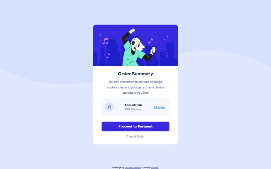
Design comparison
Solution retrospective
Hi everyone, I am beginner in web development and this is the first web development project I have worked on. I am hoping to get some feedback and tips on my code and project approach. What are the areas that can be improved/ tackled with different approach.?
I struggled to adjust the background image as shown in mock up. I used following code but could not achieve the same result.
body{ background-image: url(); background-size: contain; background-repeat: no-repeat; min-height: 100vh;
How to adjust the background image ?
Community feedback
- @afrusselPosted over 3 years ago
Your main container is not center align vertically. For background image please take a look at the following
body{ background-color: var(--pale-blue); background-image: url("images/pattern-background-desktop.svg"); background-repeat: no-repeat; background-size: 100% 50%; display: -ms-grid; display: grid; -webkit-box-pack: center; -ms-flex-pack: center; justify-content: center; -ms-flex-line-pack: center; align-content: center; }
Marked as helpful2@VinayakDhamnekarPosted over 3 years ago@afrussel Thank you for your feedback. I will implement it.
0 - @hafizanadliPosted over 3 years ago
You can use background-size:contain instead of cover. And add background-color too
0@VinayakDhamnekarPosted over 3 years ago@hafizanadli Thank you for the tip. I did not know that I have to use background-color property.
0
Please log in to post a comment
Log in with GitHubJoin our Discord community
Join thousands of Frontend Mentor community members taking the challenges, sharing resources, helping each other, and chatting about all things front-end!
Join our Discord
