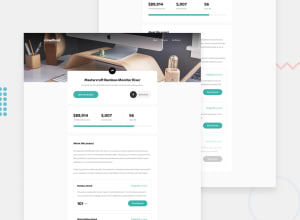
Design comparison
Solution retrospective
Hello! This is my solution
Community feedback
- Account deleted
Hi, Good job on completing the challenge.
I think I may have run into a little bug, when the mobile menu is active and then you switch to desktop mode it still stays on there, whereas it should get automatically dismissed.
Otherwise everything is fine.
Keep coding👍.
2 - @ApplePieGiraffePosted over 3 years ago
Hi there, Yeimy! 👋
Well done on this challenge! 👍
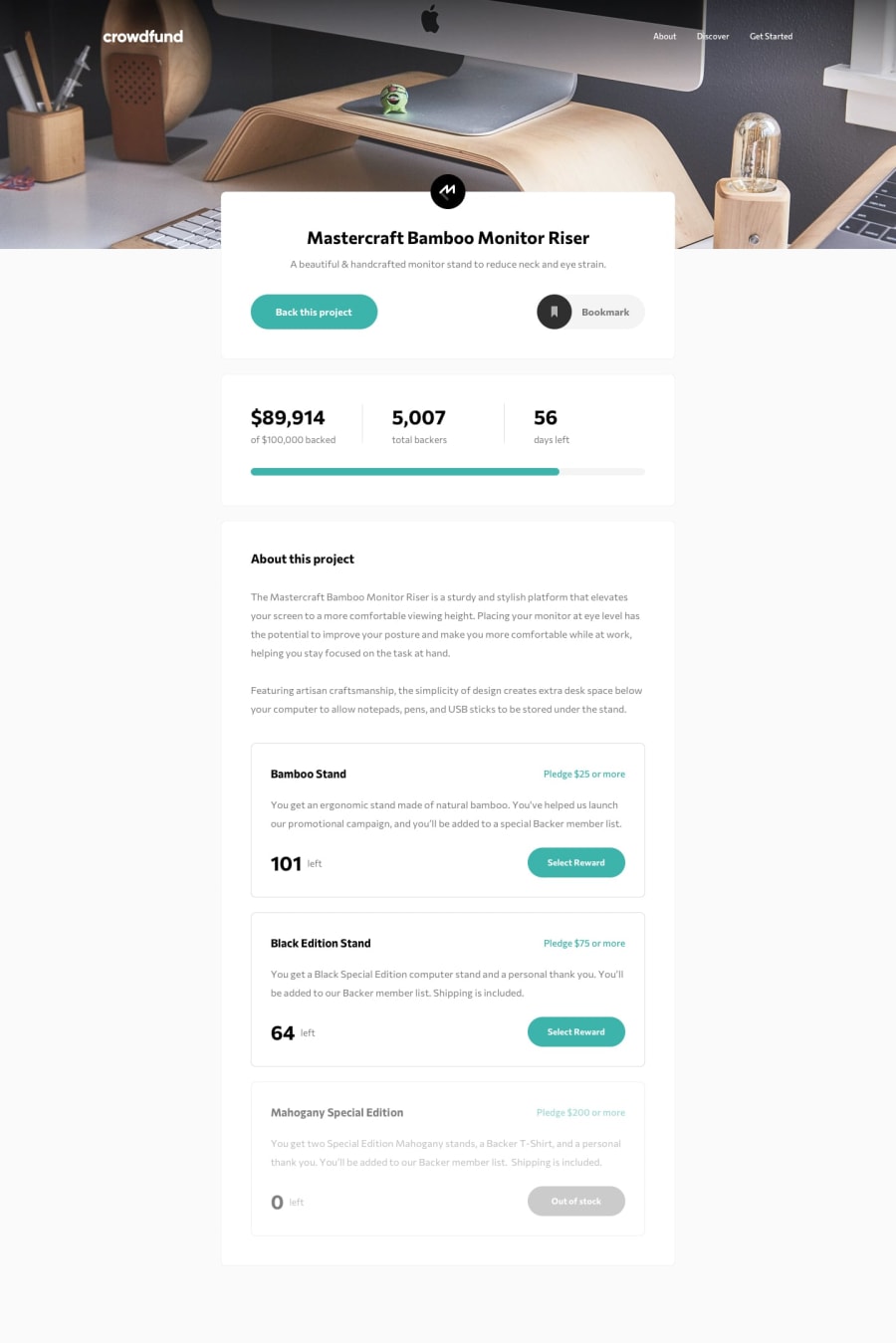
One small thing I'd like to suggest is to allow users to bookmark the page by clicking on the entire bookmark button (not just the icon) to make things a little easier for them.
Also, it would be good if you added some validation to the form that a user uses to submit a donation to ensure that they do not submit a donation that is lower than the minimum amount specified. 😉
And one last tip—adding
cursor: not-allowedto the last, disabled product card button might be a nice touch! 🙂Keep coding (and happy coding, too)! 😁
1
Please log in to post a comment
Log in with GitHubJoin our Discord community
Join thousands of Frontend Mentor community members taking the challenges, sharing resources, helping each other, and chatting about all things front-end!
Join our Discord
