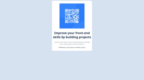
Submitted over 1 year agoA solution to the QR code component challenge
CSS flexbox and HTML for mobile and desktop
@colombeg

Solution retrospective
What are you most proud of, and what would you do differently next time?
I only used basic HTML and CSS in order to realize this project but I will use diverse libraries or methodologies for future projects.
What challenges did you encounter, and how did you overcome them?I used media queries for the mobile format of the challenge.
What specific areas of your project would you like help with?I would like to have a better understanding on how I can improve my code and how I can create responsive projects or apps.
Code
Loading...
Please log in to post a comment
Log in with GitHubCommunity feedback
No feedback yet. Be the first to give feedback on Colombe G's solution.
Join our Discord community
Join thousands of Frontend Mentor community members taking the challenges, sharing resources, helping each other, and chatting about all things front-end!
Join our Discord