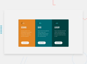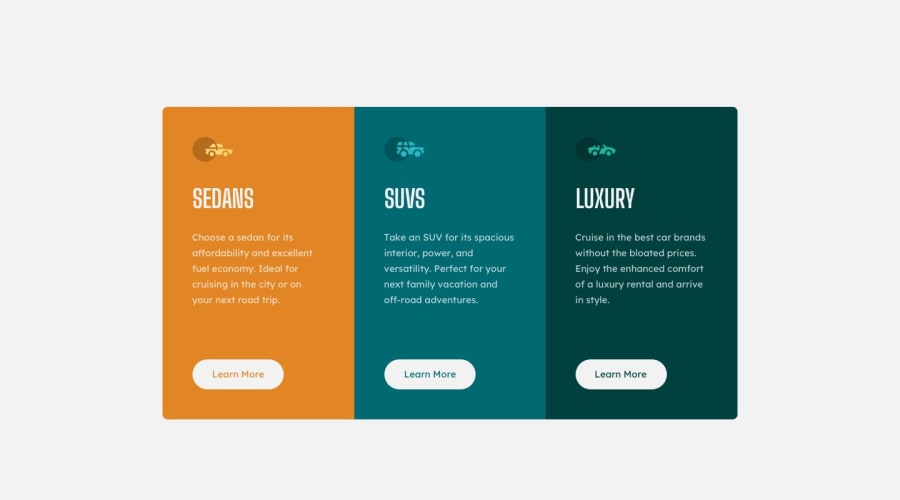
Design comparison
SolutionDesign
Solution retrospective
Any feedback is welcome
Community feedback
- @denieldenPosted over 2 years ago
Hey Sam, congratulations on completing the challenge! You did a great job 😉
Let me give you some little tips for optimizing your code:
- Tip of graphic design: with
font-family:" Big Shoulders Display ", cursivethe browser will use the Comics Sans font when it doesn't find the first font indicated (you can seen during loading)... for the designer it's a really awful font! I would rather replace it with afont-family:" Big Shoulders Display ", sans-serifmuch more similar to the primary font. - remove
width: 100%frommaintag because it's superfluous - it also assigns the same border to the normal state of the buttons so that when you hover over them you don't see that leap in the design
- add
transitionon the element with hover effect
Hope this help! Happy coding 😁
Marked as helpful1@Sam-KikomaPosted over 2 years ago@denielden Appreciate the feedback. I'll definitely look into optimizing my code
1 - Tip of graphic design: with
- @Deevyn9Posted over 2 years ago
Hi, Great representation, adjusting the width of the buttons would be gret. Happy coding
0
Please log in to post a comment
Log in with GitHubJoin our Discord community
Join thousands of Frontend Mentor community members taking the challenges, sharing resources, helping each other, and chatting about all things front-end!
Join our Discord
