Not Found
Not Found
Not Found
Not Found
Not Found
Not Found
Not Found
Not Found
Not Found
Not Found
Not Found
Not Found
Not Found
Not Found
Not Found
Not Found
Not Found
Not Found
Not Found
Not Found

Submitted

CSS flexbox

Luka-998β€’ 70

@Luka-998

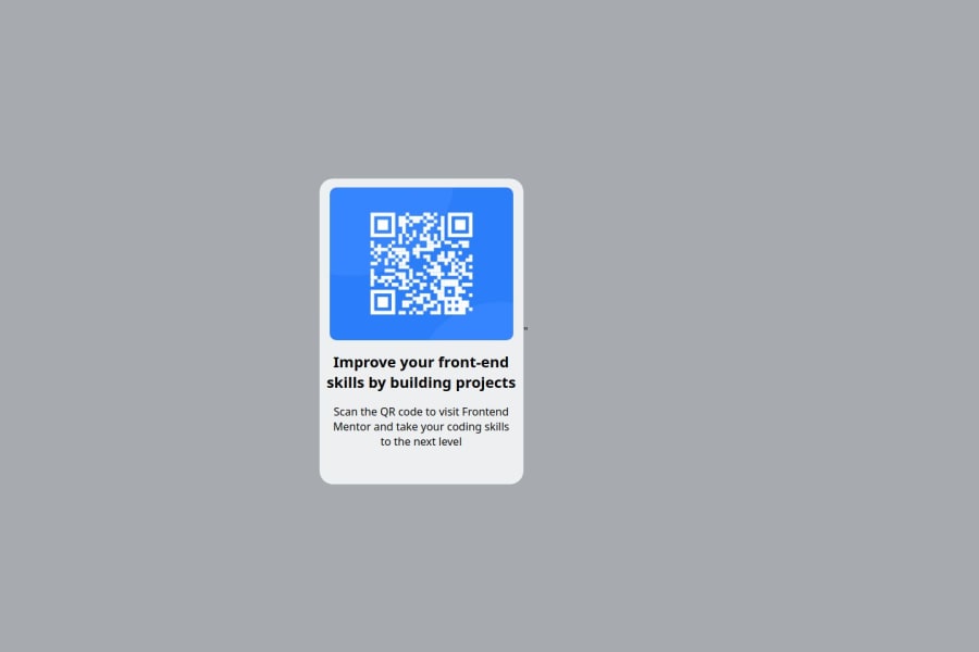
Desktop design screenshot for the QR code component coding challenge

This is a solution for...

  • HTML
  • CSS
1newbie
View challenge

Design comparison


SolutionDesign

Solution retrospective


What are you most proud of, and what would you do differently next time?

I am most proud of understanding flexbox orientation and aligning child container in this first project.

I will try differently to approach my CSS by applying styles to the main element first (body, parent, child).

What challenges did you encounter, and how did you overcome them?

My biggest challenge was positioning the child container inside parent container and after that positioning the text, but i solved it quickly.

What specific areas of your project would you like help with?

I would like to get more understanding of class selectors.

Community feedback

Teodor Jenklerβ€’ 3,720

@TedJenkler

Posted

Class selectors style elements with a specific class attribute. They use a period (.) followed by the class name. CSS specificity determines which rules are applied when multiple rules could match the same element. The higher the specificity, the more important the CSS rule.

Here’s the order of specificity from highest to lowest:

Inline Styles: Applied directly to the element. (Try to avoid using inline styles unless necessary for styled components.)

ID Selectors: Applied to elements with a specific ID. (Try to avoid using IDs for styling as much as possible due to high specificity.)

Class, Attribute, and Pseudo-class Selectors: Applied to elements with a specific class, attribute, or state (e.g., :hover). (Use these for most styling.)

Element and Pseudo-element Selectors: Applied to elements or parts of elements (e.g., p tag, ::before). (Use these for general styling.)

Hope this helps!

Best, Teodor

Marked as helpful

0
MikDra1β€’ 6,170

@MikDra1

Posted

To make the image the size that you want I encourage you to use this technique to make the card responsive with ease:

.card {
width: 90%;
max-width: 600px;
}

On the smaller screens card will be 90% of the parent (here body), but as soon as the card will be 600px it will lock with this size.

Also to put the card in the center I advise you to use this code snippet:

.container {
display: grid;
place-items: center;
}

Hope you found this comment helpful πŸ’—πŸ’—πŸ’—

Good job and keep going πŸ˜πŸ˜ŠπŸ˜‰

Marked as helpful

0

Luka-998β€’ 70

@Luka-998

Posted

@MikDra1 Hi!

Sorry for a late response on this comment, it was extremely useful to me. I have acknowledged your suggestion and I will implement it from now on. Thanks from heart <3

0

Please log in to post a comment

Log in with GitHub
Discord logo

Join our Discord community

Join thousands of Frontend Mentor community members taking the challenges, sharing resources, helping each other, and chatting about all things front-end!

Join our Discord