Design comparison
SolutionDesign
Solution retrospective
I will be happy to hear any feedback and suggestion!!!
Community feedback
- @boedegoatPosted over 2 years ago
Good work @AditNovadianto
To address those ACCESSIBILITY issues, add <main> tag to be the container.
Other than that, keep learning and enjoy coding ☕
Marked as helpful1 - @besttlookkPosted over 2 years ago
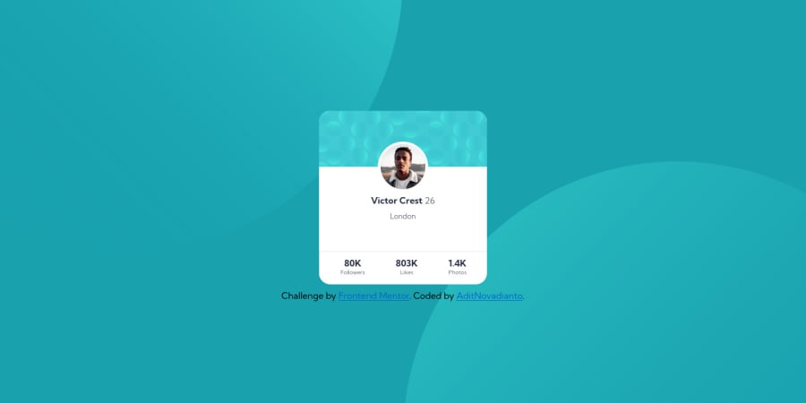
Increase the size of hero image. Also there is alot of white space after "london".
Also increse the gap between card and Link.
Good luck #happyCoding
Marked as helpful0 - @Kl3vaPosted over 2 years ago
You would want to place the footer at the bottom of the page. So far, it’s too close to the component.
0
Please log in to post a comment
Log in with GitHubJoin our Discord community
Join thousands of Frontend Mentor community members taking the challenges, sharing resources, helping each other, and chatting about all things front-end!
Join our Discord
