

Design comparison

Solution retrospective
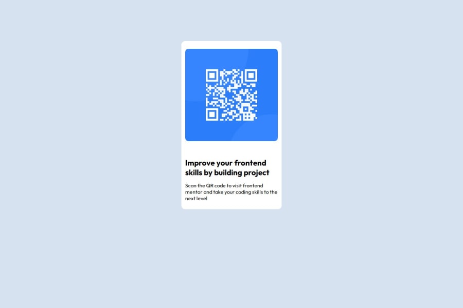
For this solution, it is my first attempt after almost 4 years since I did active frontend development.
I was able to use Flexbox to Center the card and did a little styling for mobile.
There are changes I do hope to make to the code.
What challenges did you encounter, and how did you overcome them?The major challenge I encountered are :
-
Centering the Element Properly without using padding top and padding bottom (I still had to use them)
-
Selecting the right measurement for border radius and other elements on the page
-
Centering Element Properly without using padding (I used flexbox with accompanying align-items but still had to use padding)
-
Image Styling
-
Selection of the right measurements for web elements
Community feedback
- @phamyuutoPosted 13 days ago
Does the layout look good on a range of screen sizes?
0@adeisbrightPosted 10 days ago@phamyuuto , from my test so far, yes.
If you notice any discrepancy, please do let me know
0

Please log in to post a comment
Log in with GitHubJoin our Discord community
Join thousands of Frontend Mentor community members taking the challenges, sharing resources, helping each other, and chatting about all things front-end!
Join our Discord